Pantone Releases VIEW Colour Planner Autumn/Winter 2016/2017
February 19, 2015
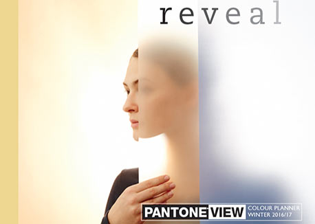
Pantone has introduced Reveal, the Autumn/Winter 2016/17 edition of its PANTONE VIEW Colour Planner. This multi-platform forecast offers seasonal inspiration, key color direction and suggested color harmonies.
Just as the current direction in lifestyle fashion reflects a genuine polarization, color stories for 2016/17 display a contrast between color that is real and unreal, absent and present and a mixology of what is in between
“We find this idea of absence and presence – obscuring and revealing – very relevant not only when it comes to color, but also in the way we live our everyday lives,” said Laurie Pressman, vice president, Pantone Color Institute. “On one hand, there is this wish to return to the simple, honest and unassuming, and on the flip side, a continuing presence of maximalist and a deep desire to stand out and be seen.”
PANTONE VIEW Colour Planner contains eight trend palettes, as well as key seasonal color direction.
- Black – newly appreciated as a prestige color, black is the pulsating force behind the forecast and the perfect canvas on which other colors are revealed.
- White – appearing in cool and warm guises, white is important because of its properties as opposed to its actual color.
- Grays – essential to the palette, grays stretch across a variety of hues, warm and natural, muted and hard.
- Green – this season, greens take two directions: the first is a more yellowish and olive-oil-led direction while the second is cooler, sometimes glassy, but also more mineral, cool and Nordic.
- Yellow – reminding us of light and radiance, yellows are important this season because of their warming presence and their effects on surface and texture.
- Orange – now suffused with spicy hues, shades in the orange family display influences of caramel, cinnamon and saffron.
- Purple – penetrating all levels of design, purples – in a variety of berry color – are now a lifestyle as opposed to a fashion shade and are critical to this season’s palette.
- Blue – becoming more sophisticated, blues move away from the more classic indigo shades to those that are infused with gray or green.
- Brown – from nutmeg and tan to the red infused winey red browns, the browns continue to be very important across all materials and surfaces.
- Red – a safe option for those looking to add bright color, red is a well-received and well-understood pop color that is being combined in new ways.
- Pastels – pastel shades leap from nuanced neutrals to stronger and more assertive color.
- Metallics – metallics remain important; however, this season they are as pragmatic as they are decorative, combining with light or texture to enhance, bring movement and textural dimension.
More News
April 23, 2024 | Trends & Inspirations
Sustainability Report: More Education Needed for Green K&B Design
April 22, 2024 | Awards & Events, Trends & Inspirations
A Look Inside the 2024 Atlanta Homes & Lifestyles Southeastern Designer Showhouse
April 22, 2024 | KBB Collective
Top Designer Shares Favorite KBIS 2024 Products
April 22, 2024 | Trends & Inspirations
Survey: Nearly Half of Homeowners Invest in Green Plumbing
April 21, 2024 | Business
ADJ Interiors Moves Offices
April 2, 2024 | Sponsored
Whirlpool Corp. Brings Purposeful Innovation Home