Overcoming the Fear of Bold
August 17, 2015
Photography by B.A.K. Interiors
For designer Bryan Alan Kirkland of Atlanta-based B.A.K. Interiors, the best designs start with tone and build up with pattern and juxtaposing colors.
“Your clients often look at the same magazines and the same looks over and over again, and therefore become convinced of their own style,” Kirkland explained at a talk at the Atlanta Decorative Arts Center. “Trying to take your clients a little out of the box can be rewarding.”

Photography by B.A.K. Interiors
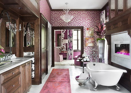
While he stressed that indeed designers need to follow a client’s requirements and tastes, clients are looking at the designer as the professional as well. He referred to a recently completed project in Cumming, Ga., where the clients specified a rustic look. However, upon meeting them and realizing their loud personalities, Kirkland suggested a bolder look that the clients fell for.
“The end result was a loud use of color and pattern that fit their larger-than-life personalities and the style of their home,” said Kirkland.
On the other end, he suggests honoring those quieter personalities with softer tones, but still pushing the client toward some different touches to fulfill the design. One project he recently completed in Cabo San Lucas, Mexico, also departed from his usual taste with soft blues and neutrals so not to clutter the view, which he explains is the first priority in a destination home.

Photography by B.A.K. Interiors
In any design, however, Kirkland advises not to be afraid to play. Showing a series of several palettes, he explained how he combines multiple colors, textures and patterns into one design.
Gold
• Combine pewter and gold tones.
• Add metallic touches and undertones.
• Bring in a fur throw or pillow.
• Use sheer window treatments with horizontal lines.

Gray
• It’s all about what tones enhance the main one.
• Gray today usually has a blue undertone off of which to play.
• Consider a bold printed item, like a floral or animal print.
• Weave in metallic for a subtle shine.

Blues
• Pick one tone out of an item and romance it.
• Geometrics and florals can mix in small amounts, i.e., a chair and a pillow in the same area.
• Don’t put the focus on one item by balancing the darker blues.
• Consider a unique wallpaper or accent piece to make a statement.

Red
• This can be traditional with an edge depending on placement and tone.
• Softer but more interesting looks are achievable by using juxtaposing colors, like an orange piece near a red item.
• A fabric or wall with an off-white background will suit a red palette with a more traditional appeal.
Bryan Kirkland is a leading Atlantan interior designer and has been recognized by Veranda Magazine as “One of the Top 25 Designers in Atlanta,” The “One to Watch in 2015 “ by Atlantan, “Best of Atlanta” by Atlanta Magazine and nominated “2013 Designer of the Year” by the Atlanta Decorative Arts Center. His work has been showcased in show houses, such as The Atlanta Symphony Decorators Show House, Saint Phillips Cathedral Inspiration, House Hay House Macon Gardens, Mansions & Moonlight and The Junior League Show House of Fort Lauderdale.
More News
April 25, 2024 | Awards & Events
2024 Coverings Installation & Design Award Winners Announced
April 24, 2024 | People
Oatey Announces New COO and CCO
April 23, 2024 | Trends & Inspirations
Sustainability Report: More Education Needed for Green K&B Design
April 22, 2024 | Awards & Events, Trends & Inspirations
A Look Inside the 2024 Atlanta Homes & Lifestyles Southeastern Designer Showhouse
April 22, 2024 | KBB Collective
Top Designer Shares Favorite KBIS 2024 Products
April 2, 2024 | Sponsored
Whirlpool Corp. Brings Purposeful Innovation Home