Pantone Reveals Color(s) of the Year for 2016
December 7, 2015
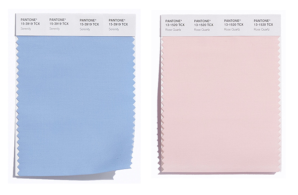
Pantone has announced PANTONE 15-3919 Serenity and PANTONE 13-1520 Rose Quartz as the PANTONE Color of the Year selection for 2016. K+BB spoke with Laurie Pressman, vice president of the Pantone Color Institute, to find out more.

Elmira Stove Works Model 1954
“In our world today, we are continually bombarded with information and finding it difficult to keep up, the global economy is uncertain, and politically there is most definitely a lot of clashing of thoughts and ideas,” said Pressman. “With the need for reassurance and the desire to quiet the mind, consumers are trying to balance their fast-paced, fractured and hurried lives with some downtime, calm and the opportunity to just switch off. The harmonious pairing of these two inviting shades, PANTONE 13-1520, Rose Quartz and PANTONE 15-3919 Serenity, embody the mindset of tranquility and inner peace consumers seem to be looking for.”

American Flat + Pantone Exclusively for Art
For the first time, two colors were chosen instead of one. Pressman put this down to the current age, showing that the selected colors are reflective of the collective mindset.
“With color and context so intertwined, there really are reasons why a color family or individual color comes into prominence when it does, and for the most part the popularity of a color is symbolic of the age we are living in,” she said. “And this was no different for 2016, where based on what we saw happening in our global culture – for the first time ever – it seemed perfectly natural for our selection this year to be not just one color but instead the fusion of two shades.”

West Elm
Serenity and Rose Quartz for Interiors
Whether on their own or combined with other shades, the pairing of Serenity and Rose Quartz bring a feeling of calm and relaxation into the home environment. Like a serene sunset, Rose Quartz encourages reflection on one’s surroundings while Serenity, a transcendent blue, provides a naturally connected sense of space.
While an ideal choice for rugs and upholstery, Serenity and Rose Quartz also work in paint and for decorative accessories. Coupling solid and patterned fabrics, throws, pillows and bedding in these shades provides a comforting respite and feeling of well being in the home. Incorporating texture enhances the duality and kinship of these hues.

KitchenAid
Serenity and Rose Quartz-colored kitchen items and tableware, as well as home accessories like candles, decorative bowls, vases and florals, add subtle color accents while contributing to a welcoming and peaceful space. Translucent, glazing, matte and metallic shine are key finishes.
“With their ability to create a calming environment, in addition to [being] flattering on skin tones, the colors are a natural for the bathroom whether for flooring, walls or accents,” said Pressman. “In the kitchen, whether in tabletop, countertop appliances, flooring or walls, the combination of these two shades helps create a welcoming and comforting space.”

Crate & Barrel
The Color of the Year selection process requires thoughtful consideration and trend analysis. To arrive at the selection each year, Pantone’s color experts at the Pantone Color Institute comb the world looking for new color influences. Previous color selections include Marsala (2015), Radiant Orchid, (2014), Emerald (2013) and Tangerine Tango (2012).
More News
April 25, 2024 | Awards & Events
2024 Coverings Installation & Design Award Winners Announced
April 24, 2024 | People
Oatey Announces New COO and CCO
April 23, 2024 | Trends & Inspirations
Sustainability Report: More Education Needed for Green K&B Design
April 22, 2024 | Awards & Events, Trends & Inspirations
A Look Inside the 2024 Atlanta Homes & Lifestyles Southeastern Designer Showhouse
April 22, 2024 | KBB Collective
Top Designer Shares Favorite KBIS 2024 Products
April 2, 2024 | Sponsored
Whirlpool Corp. Brings Purposeful Innovation Home