Shades of Gray in Kitchens
July 3, 2015
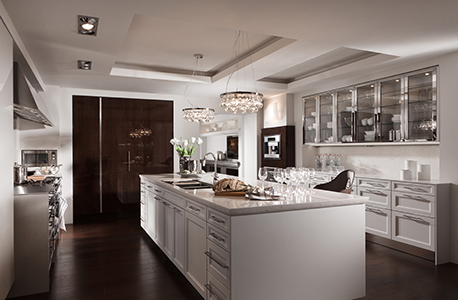
SieMatic BeauxArts.02 in Sterling Grey
The big screen isn’t the only place that’s drawing fans of shades of gray. Grays are the newest neutrals in kitchen design – along with black and white. Designers are taking this sophisticated yet tranquil palette to the walls, cabinetry, surfaces and appliances.
“The origins of the neutrals trend are rooted in Europe, where it’s been hot for some years,” said Patricia Gaylor of Patricia Gaylor Interiors, who noticed a shift toward a gray palette emerging about a year ago. “It’s finally crossed the pond, and it’s been gathering steam since.”
Gaylor attributes the newfound popularity of gray to its calming effect and as a neutral alternative to boring beige.
Gray Speaks Volumes in the Kitchen
“[A] gray, white and black [palette] is a growing trend in kitchens, especially in modern environments,” said interior designer, Mick Ricereto. “Tones of gray are heading in the direction of a warmer palette, with shades of putty ranging toward gray-brown becoming popular.
He noted colors such as SieMatic’s Agate, a changeable and versatile gray tone that appears warmer next to some finishes and cooler when placed next to others.
“This is part of the appeal to using gray tones,” said Ricereto. “They’re not somber if you use them smartly.”
Hans Henkes, president and CEO of SieMatic USA, illustrates their well-thought-out use of gray in their award-winning New York City showroom in the A&D building.
“In our BeauxArts.02 kitchen, we’ve taken a lighter, more linear design approach with cabinetry that’s enhanced by the cooler tone of our new Sterling Grey finish,” he said. “Combined with the accents, including a polished or brushed stainless steel hood and cabinet hardware, it offers that cooler tonality, which contributes to the ‘bling’ people want without being glitzy.”

Agate tile sized 1 in. by 4 in. in Lucca Pearl by Lunada Bay Tile as featured in this Charmean Neithart Interiors project. Photo by Erika Bierman
Various Tonalities of Gray Set the Mood
No matter the tone, gray is still a bit unexpected, according to Beverly Hills designer Christopher Grubb of Arch-Interiors Design Group.
“It’s a refreshing departure from wood stain, which many people had before, and the latest shades create more of an individual style,” he said. “We’re no longer reminded of gloomy gray skies and kick-around sweatpants when we see today’s fashion palette of grays. Gray can be warm and invite cocooning, and we’re also seeing tones that have more crispness than they had before.”
Feras Irikat, director of design and marketing for Lunada Bay Tile, says the current gray palette is about using different values – from the lighter to the darker tone of gray.
“We’re using multiple tonalities of grays, not just a deeper or more intense shade,” he said.
Gray Complements White and Other Shades
In addition to gray, Irikat noted that homeowners are gravitating toward the simplicity of white, which they are enhancing by using different accent colors in cabinets, appliances and accessories.
“So they are choosing tile, countertops or flooring in white with accents of black or gray,“ he added, explaining that the movement toward white in the last couple of years is playing off of a retro design inspiration with the use of Carrara marble. “In the 1920s, countertops sometimes had a white marble drop-in for working on pastries or making candy – and of course the Italians have used marble on countertops forever.
“White – and especially white gloss – is a perfect complement for countertops or contrasting the upper cabinets with the lower cabinet in gray,” said Grubb, “but white counters aren’t limited to pure white quartz surfaces. Calacatta or other marbles that have gray veining marry the two looks together extremely well.”
Grubb has also observed a trend toward using white in appliances that have a panel over them to make the kitchen appear larger. “These stealth, neutral panels add a feeling of cohesion in the kitchen, especially now as stainless steel fatigue sets in,” he added.
In addition to gray and white, today’s neutral palette includes black.
According to Ricereto, appliance makers are following the trend, as black glass is becoming a popular choice with European/world appliance brands.
Blending Creates Visual Symphony
“Gaggenau showed a new gray glass finish at IMM Cologne last month,” said Ricereto, noting that although stainless and metal finishes are still king in the U.S., appliances are much less of a design element in Europe and are usually more integrated and inconspicuous. Gray and black help them fit in better with many cabinet choices.
Blending is key, agrees Henkes, who observes that ever since the open plan began dominating design, it’s become increasingly important for the kitchen to be visually interesting and seamlessly blend into the living environment.
“It’s a visual symphony you don’t achieve with shocking color, but with neutrals that offer tone, balance and variety,” he said. “It’s the decorative accessories and small pops of discriminate color that add flavor and enhance the neutral environment. In our New York showroom in the A&D Building, we created a living environment with a palette of neutrals, as well as pops of color such as Purple Vermillion chairs from B&B Italia. We also used antique oak flooring to add warmth and depth to this corner area, which creates interesting punctuation without detracting from the center stage statement we’re making in the kitchen.”

The backsplash features Tozen tile sized 1 in. by 4-in. in Vanadium Natural by Lunada Bay Tile.
Neutrals are Practical Choice
“Neutrals can provide the ideal canvas, and it’s the layering of color on top of them through accessories and art that adds personality,” said Irikat, who clarifies there should be no rules. “Designing a kitchen or bathroom is an artistic interpretation for a specific client. I definitely think the use of a neutral color palette is more of a practical choice than a choice made for sophistication, but that’s not to say that neutrals aren’t sophisticated.”
For homeowners, most of the time it’s practical considerations that drive them toward neutrals, according to Irikat.
“Taking a home’s resale value into consideration or the ability to change palettes is what encourages them to use neutrals,” he added. “That being said, when the design needs to appeal to a wide variety of tastes, to be long lasting and have versatility, neutrals become the canvas – the backdrop for everything else. You can start with tonalities of gray, black or white and layer it with color.”
Jamie Gold, CKD, CAPS, a designer in San Diego and the author of New Kitchen Ideas That Work, (Taunton Press), sees the embrace of white and black neutrals, specifically happening more on the traditional and transitional end than in modern designs, and like Irikat, also observes practical considerations.
“Consumer motivations have changed. The desire for a neutral palette is usually tied to a client’s personal preferences or their concerns about resale,” she said, citing the kitchen countertop, where classic white once held up a desire for hygiene and cleanliness. “This is no longer weighing into the design decision. A countertop that offers hygienic properties, like Silestone, delivers the cleanliness benefit in whatever color the designer or client selects.”

This kitchen, designed by Interior Designer Christopher J. Grubb of ARCH-INTERIORS design group, pulls in gray and white.
Add Personality with Splashes of Color
Irikat delves into the psychology behind neutral color choices. “It can be a fear of color,” he said. “Studies show that we as a society suffer from Chromophobia, the persistent, irrational fear of – or aversion to – colors, and neutrals have become the solution for people who have not yet embraced their own personal taste or love for color – or they are afraid to express it. That’s why a lot of people tend to use neutral shades. It’s not to say that neutrals can’t be used successfully and beautifully, but they don’t always represent a person’s true personality or affinity for color.”
Ricereto has a different view. “It would seem that using gray tones would stifle personalization,” he said, “but it is just a color scheme, and those who love bold colors would probably avoid the trend or use colors in accessories. In fact, gray, white and black are a great base for designing with strong accents, which in itself is a big trend at the moment. Especially with the flea market-type look still so prevalent, the faded and distressed finishes of salvage finds really pop out with a base of gray, and together these two trends complement each other.”
So while kitchen designers and manufacturers agree that there’s a refreshed movement toward neutrals – and that they will always be en vogue because of the simplicity they lend to the more architectural and permanent elements of a kitchen installation – they concur that change is always the undercurrent. While consumers still see the refreshed palettes of neutrals as new, the tide is already changing in Europe.
“Classic kitchens have long been shown in white, but we are also starting to see bolder or deeper colors on painted cabinets in the European markets,” said Ricereto, who just returned from IMM Cologne. “While the white, glossy, paneled kitchen remains a staple on the our side of the pond, some of Europe’s new ideas will likely be revealed to us soon. For modern kitchens, however, the gray palette is here for the long haul.”
More News
April 19, 2024 | Business
Artistic Tile Paramus Unveils New Location
April 18, 2024 | Business, People
Excelling at Kitchen Design When You Don’t Like to Cook
April 18, 2024 | Awards & Events
KCMA Design Awards Announces Winners
April 17, 2024 | People
WAC Lighting Promotes Becky Li to President
April 16, 2024 | Awards & Events
Kips Bay Boys & Girls Club Honors Ellie Cullman, Cosentino
April 2, 2024 | Sponsored
Whirlpool Corp. Brings Purposeful Innovation Home