May 19, 2016
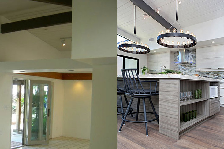
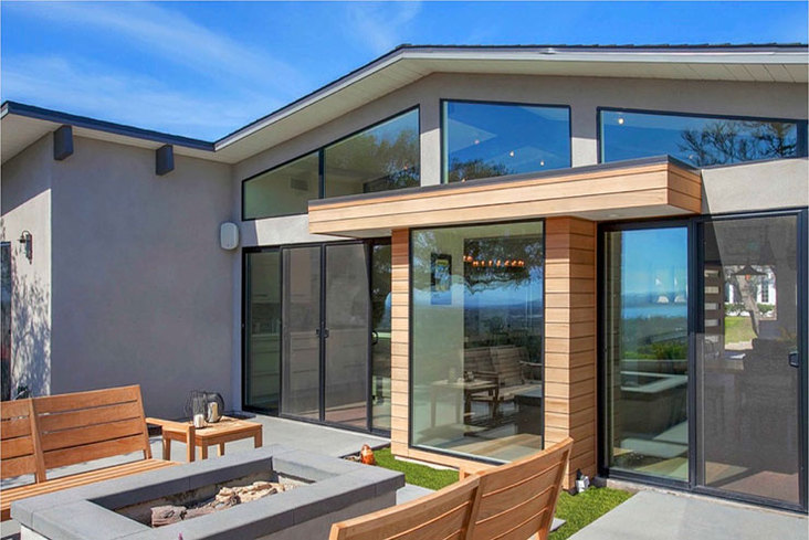
Inside a dim and closed-off kitchen space, a good exterior view can sometimes get lost. This was the case for one single-story gable home, which still sported a 1960s design and felt detached from its sweeping views of Mission Bay and the Pacific Ocean.
“It was hard to tell there was a gorgeous view just outside,” said designer Sol Quintana Wagoner of San Diego, Calif.-based Jackson Design and Remodeling, who worked in collaboration with Liz Carter, John Kavan and Karina Kmiotek on the design. “The 1960s home had many appealing architectural elements typical of mid-century modern architecture, but the home’s compartmentalized layout was dark and separated from its environment.”
View this kitchen gallery here.
Renewing the Original Idea
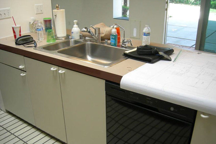
The original floor plan included a galley-style layout with a slide-out door onto the patio. Outdated appliances, hardware and cabinetry outfitted the design, with the only positive components being tongue-and-groove ceilings and exposed beams.
With mid-century modern back in style, the design team wanted to play up some of those original ideas in a contemporary setting that connected with the outdoor view. Elements they focused on emphasizing were linear shapes, wooden architectural materials and an airy space. For the clients, the priorities were also to make the home’s location and panoramic views central in the design.
“The family is expanding to include grandchildren, and they wanted to embrace indoor/outdoor living in a space they could open to friends and family,” said Wagoner. “It was also important to them to retain the original mid-century modern spirit of the home in the new design.”
Problem-Solving by Looking Outward
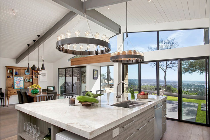
According to the designer, the biggest challenge was dealing with the existing structural components – including promising high ceilings – while trying to instill sight lines, balance in the interiors and interest on the exterior.
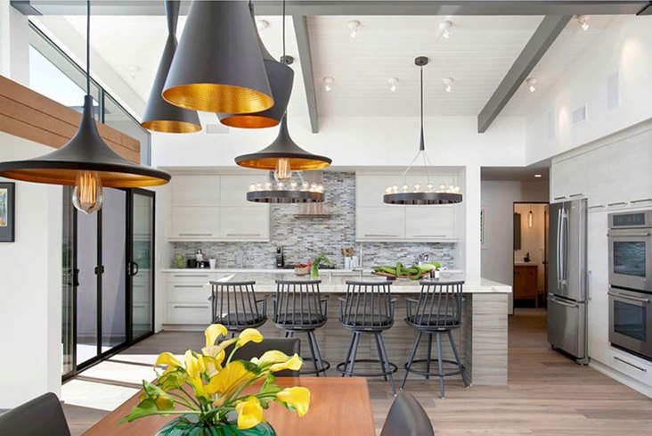
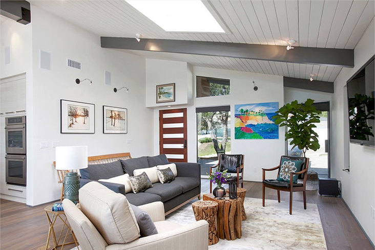
“To resolve this, we created a focal point [through the main window] that runs through the front door out to the back, bringing attention to a stunning view,” he said, explaining that the new floor plan removed the barriers between the front door, living space and kitchen to create a continuous space.
With the newly opened space, the high ceilings and floor-to-ceiling windows make the view the focus from the front door even before fully entering the kitchen. Once the window was in place, a tree in the rear yard was perfectly centered for a focal point and helped draw sightlines outward.
“From the direction of the flooring, to the grain on the cabinets and the long horizontal cabinet handles and backsplash tiles, everything was designed in a linear direction to deliberately lead the eye to the view outside,” said Wagoner.
Difference in the Details
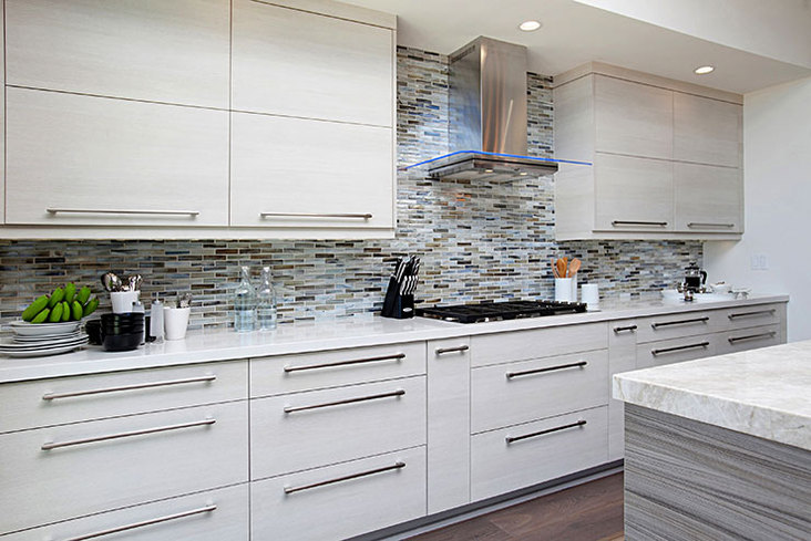
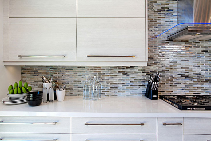
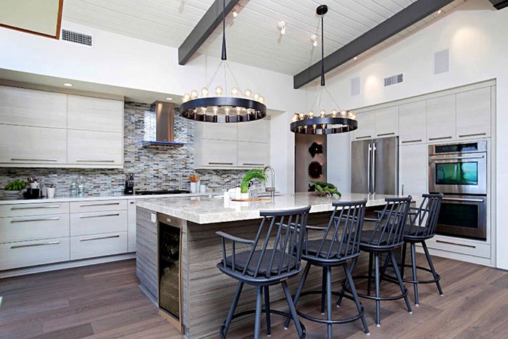
The birch-colored cabinetry with brushed nickel hardware boasts strong horizontal lines that point to the view. The light cabinetry was selected to maintain an open feeling, while a soffit built along the perimeter of the kitchen conceals appliances and brings human scale to the space while retaining the room’s expansiveness. To connect the white and gray palette to the outdoors, the tile mosaic backsplash uses shades of green, blue and brown, and its iridescent textures echo the nearby ocean.
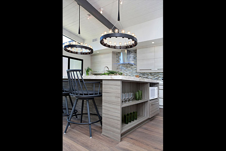
At the heart of the kitchen, a large island topped with a single piece of quartz visually anchors the entire space. With a 2-1/4-in. detail around the edge, the island and its four-seat bar become a furniture-like statement in the space. The gray, horizontal grain cabinetry mimics the pale perimeter cabinets but has a more distinct, wider pattern. Above the island are two bold chandeliers designed by Rico Spinet for Robert Abbey that mix a rustic and mid-century modern style.
“I discovered the bold chandeliers some time ago and waited for the perfect home to feature them in,” said Wagoner, pointing out that the mid-century modern-inspired pendants were unconventionally placed over the dining room table and the chandeliers over the island for a deconstructed feel. “Architectural elements of the home, such as the windows and doors, are dark bronze, and we repeat this concept in almost all of the lighting throughout the house – treating the lighting as an element of the architecture rather than simply using it as a light source.”
The existing tongue-and-groove ceilings were painted white and the exposed beams gray to create contrast and include wood in the design. Windows and doors were painted with a black trim to make them more prominent as architectural elements against the huge windows.
“We love how the design takes advantage of the location’s incredible views and keeps its mid-century modern soul,” said Wagoner. “The materials were carefully considered with subtleties that may be invisible to the naked eye but are unconsciously recognized, directing the eye to focus on the view of the natural surroundings.”
Source List:
Design Firm: Jackson Design and Remodeling
, www.jacksondesignandremodeling.com
Senior Interior Designer: Sol Quintana Wagoner
Assistant Designer: Liz Carter
Residential Designer: John Kavan
Interior Stylist: Karina Kmiotek
Photo Credit: Jackson Design and Remodeling
Backsplash: Arizona Tile
Beverage Center: GE
Cabinets: DeWils
Cooktop: Jenn-Air
Countertops: Arizona Tile and Tutto Marmo
Dishwasher: Jenn-Air
Double Oven: Jenn-Air
Faucet: Blanco
Flooring: Flooring San Diego
Hood: Zephyr
Lighting: Lamps Plus
Refrigerator: Jenn-Air
Undermount Sink: Blanco
