March 24, 2014
In a world filled with busy schedules, minimalistic designs are becoming more often the norm. “Minimalism is about the right gesture in the right place,” explained designer Bartolomeo Bellati of Minimal USA. Bellati and Stefano Venier, managers of the firm’s U.S. headquarters, worked in collaboration with designer John Beckmann of Axis Mundi on one such project in New York’s Upper East Side.
View this bath and kitchen gallery here.
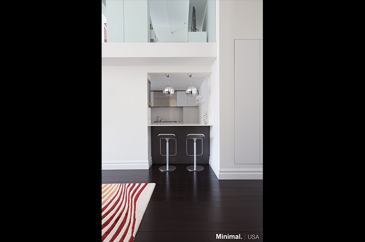
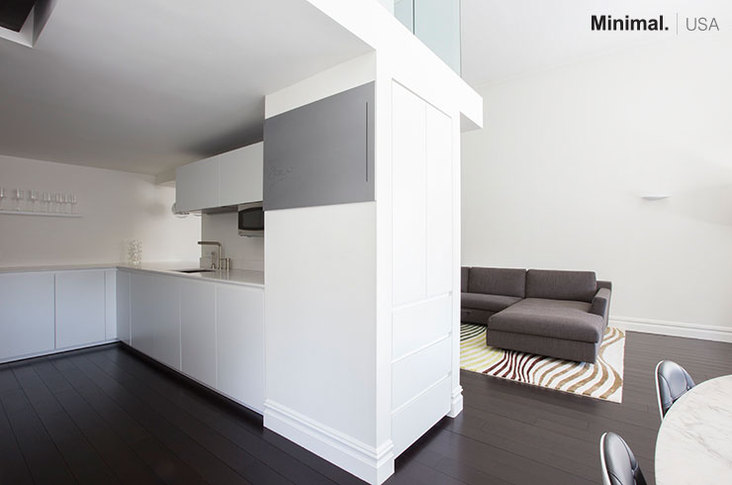
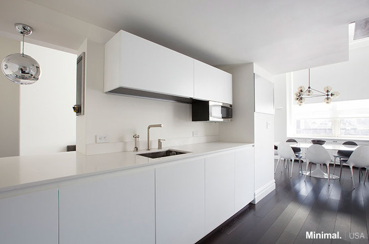
Formerly part of a Gimbel’s department store, this apartment renovation had a fairly modest budget and a specific brief. “The client specifically wanted a place that was monochromatic,” said Venier. As could be expected in the city, the kitchen only had 43 square feet of space. “We had to ensure the kitchen blended seamlessly together,” he added.
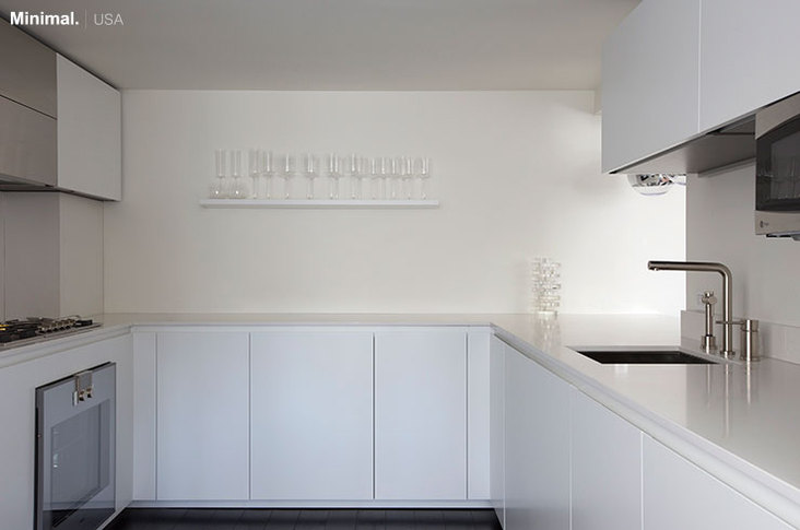
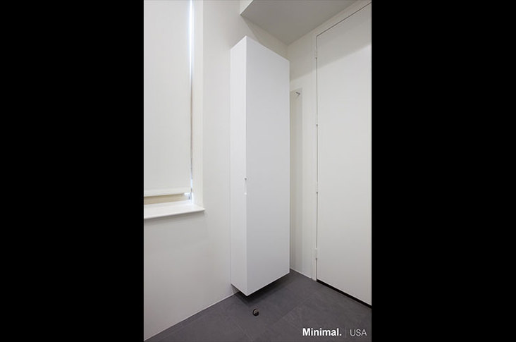
Hiding the modern amenities behind white lacquer cabinets, the design team created a simple, clean look. “The white countertop not only lights up the small space but also makes the kitchen sleek and clean,” said Bellati. The upper cabinets complete the storage system and illuminate the below space with LED strips. To keep the space open, a bar counter looks onto the adjacent living room space. “It’s an ideal solution for entertaining guests but also for the client’s children without having them in the kitchen,” added Venier.
Keeping with the minimalistic feel, an almost translucent shelf blends in with the wall for glass storage. “We like how the kitchen is there when needed and allows for interaction with the dining room and living room, but disappears when not in use,” said Bellati. “However, aesthetics are not the only factor; ergonomics and functionality always plays a key role.” To illuminate the space with a warm but clear light, the team use LED strips, as well as sconces and standing lamps.
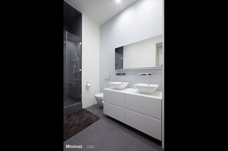
An open and modern design was also asked of the master bath. Against subtle, glass-beaded wallpaper, the rectangular vanity boasts a structural quality with a horizontal groove in the center and mitered, 45-degree edges. “This sculpture-like vanity, in glossy white lacquer, not only enhances the elegance of the bathroom but is also a sleek solution for giving more storage space,” said Bellati. The bottom drawers hold cutouts for plumbing, and the sinks sit above the counter so no space is wasted.
The team also designed a hanging cabinet, which is made of 10 coats of white lacquer, the same material of the vanity, and has a mitered edge for a seamless close. “The cabinet not only gives more storage space but also represents an elegant solution for the overall design of the room,” said Venier.
In contrast to the white cabinet and vanity, the shower showcases a dark and inexpensive porcelain tile that looks like stone. “What’s nice about it is it comes in a very large size, so there are less grout lines and it’s more seamless looking,” said Beckmann. Walnut floors complete the look.
“In minimalistic design, there is no room for error; the craftsmanship has to be perfect,” explained Bellati. “It’s about the materiality of place. The materials will speak and carry the work if the geometry is correct.”
Creating a Minimalistic Design in a Small Space
The design team had one major tip for such a challenge. “Reduce, reduce and reduce. Then take something out!”
Here are some additional pieces of advice when starting a similar project:
• Focus on materials. With fewer materials, each detail is more noticeable.
• Hide the amenities as much as possible for that streamlined look.
• Functionality is a top priority in a design meant for simplicity. Keep craftsmanship and geometry in mind.
• Use LED strips and sconces to eliminate obtrusive lighting fixtures.
• Mitered edges lend a sculptural detail to an otherwise streamlined design.