January 29, 2021
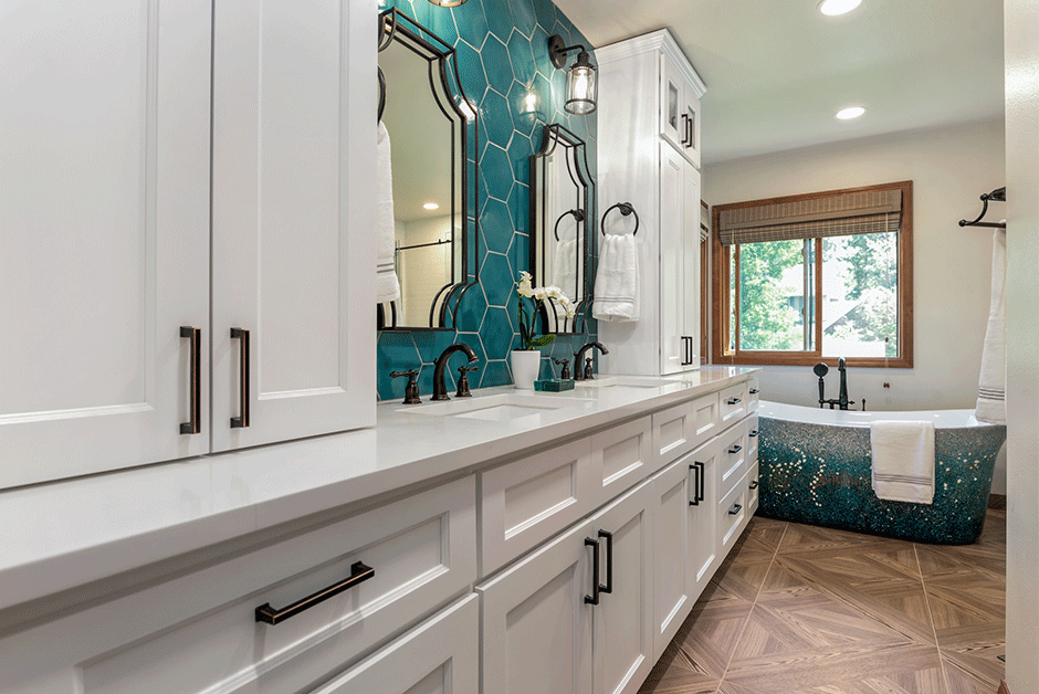
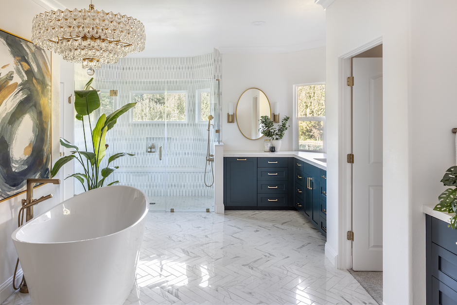
The right balance of color will not only update a primary bath design but will also infuse the room with personality – a characteristic many clients ask for today. Faced with a drab, builder-grade room, Wendy Nolan of Spokane, Wash.-based 509 Design renovated the space starting with a standout color.
Finding Inspiration in a Colorful Tub
“Everything was a 1990s builder beige and was void of any interest,” said Nolan, who used Chief Architect Premier to turn around this closed-off and dated bath.
This was not the first time she had worked with these clients and their current home. After having renovated their living room, she wanted to keep a consistent flow throughout the house and support their new updates. The living room’s light maple, hardwood floors worked especially well with teal green and blue accents, so the designer set out to find a focal point for the primary bath design with these colors.
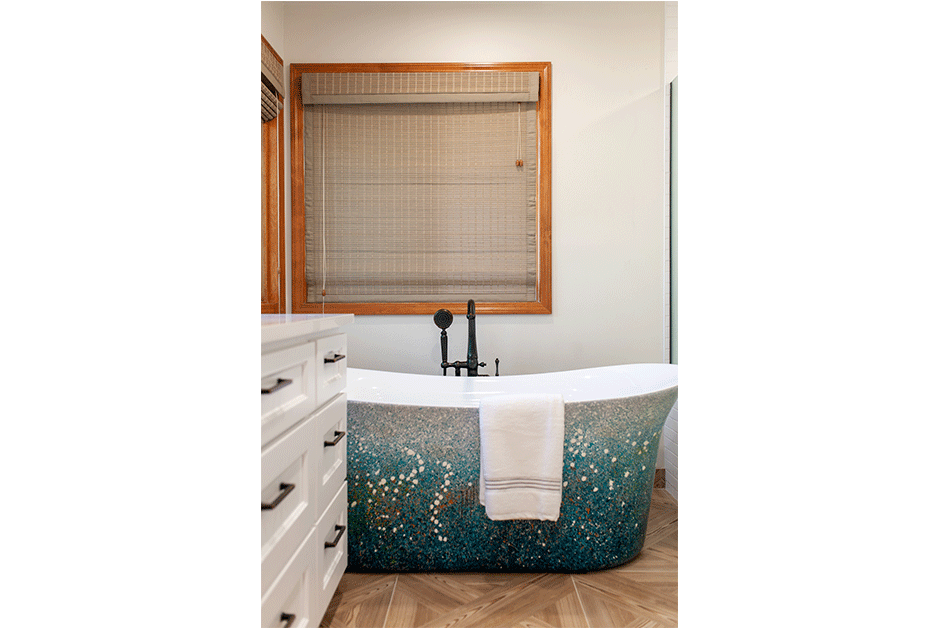
“This tub was the inspiration for the entire space,” said Nolan, who loved that it incorporates a variety of colors – particularly the teal blue – she had used as an accent hue in the living room. “It allowed us to have great continuity throughout the rest of the home.”
The tub itself is hand painted, with touches of lavender, green and white intermixed with the overall aqua and teal color scheme. Its acrylic construction is easy to clean, and it has a modern shape that does not distract from the tub’s colorful exterior.
“It really fit the color story of the house and had gorgeous visual appeal with an interesting pattern,” said the designer.
Pattern and Proportion in the Primary Bath Design
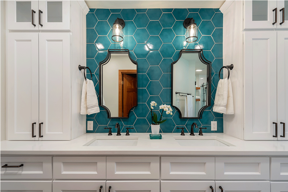
For an additional focal point in the space, the designer decided to echo the tub’s color in the backsplash between the vanity’s two cabinet towers. However, finding the right teal tile was a challenge.
“Knowing we wanted to tile the entire backsplash, we needed to get the scale correct,” said Nolan, explaining that if the tiles were too big or too small, they would look awkward in the space. “The 8-in. hexagon tile fits proportionally, and the color perfectly coordinates with the tub.”
The flooring adds a parquet pattern to the space that helps ground the room. This 24-in. by 24-in. matte porcelain tile is a soft maple color that mimics the floor color used throughout the home.
Balancing the Colorful Focal Points
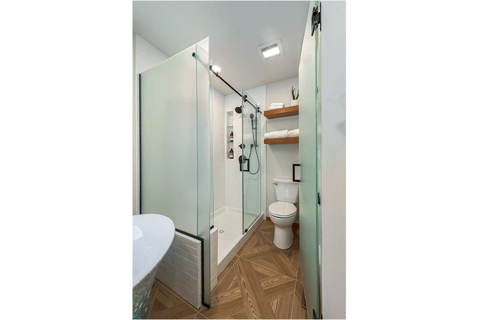
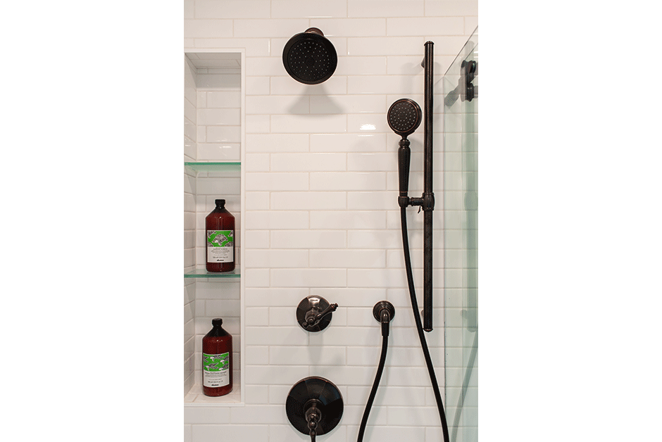
With these warm shades and the tub and backsplash stealing the show, Nolan wanted to keep the rest of the primary bath design calm without a lot of color or pattern. She did this in the shower with a simple white, enlarged subway tile that makes the room feel light, bright and clean looking. The toilet area is surrounded by plain frosted-glass doors, which let light in while providing the privacy the client wanted. The vanity is painted white and features white quartz countertops and matte black hardware – a finish that is repeated on the plumbing fixtures and the pendants over the vanity.
“The matte black finish offers great contrast,” said Nolan. “We like that it brought some additional drama into the space.”
Source List
Designer: Wendy Nolan, 509 Design
Photographer: Kayleen Michelle, Kayleen Michelle Photography & Design
Bathroom Mirror: Signature Hardware
Cabinet Pulls: Emtek
Cabinetry: KCD Cabinets
Countertops: Capaul Stoneworks
Floor and Tub Filler, Sink Faucets & Showerheads: Kohler
Flooring & Vanity Backsplash: Tile Bar
Sconces: Quoizel Lighting
Shower Tile: Thompson Tile
Sink: Bain Signature
Tub: A&E Bath and Shower
