March 15, 2014
When two new parents started considering a second child, they also began considering a second master suite. The Palo Alto, Calif., house had the suite on the first floor and a level away from the two bedrooms upstairs, where the new baby and their mother-in-law slept.
“They were thinking if we have more kids we want to be closer to them on the same level, and the mother-in-law can still live downstairs and have her own room,” explained designer Ayesha Sikander, owner and principal designer of MA Dimensions. “They wanted to have more space because it just wasn’t working out with their family needs.”
A relatively unused den, complete with plumbing for a bar, gave the owners the opportunity to add the suite upstairs. “They wanted to keep consistency with the new addition,” said Sikander.
The home’s gray exterior was trimmed with blue, while the interior had a primarily white palette. “They asked to stay within the existing style of the home, and they didn’t want to change the color scheme,” she added.
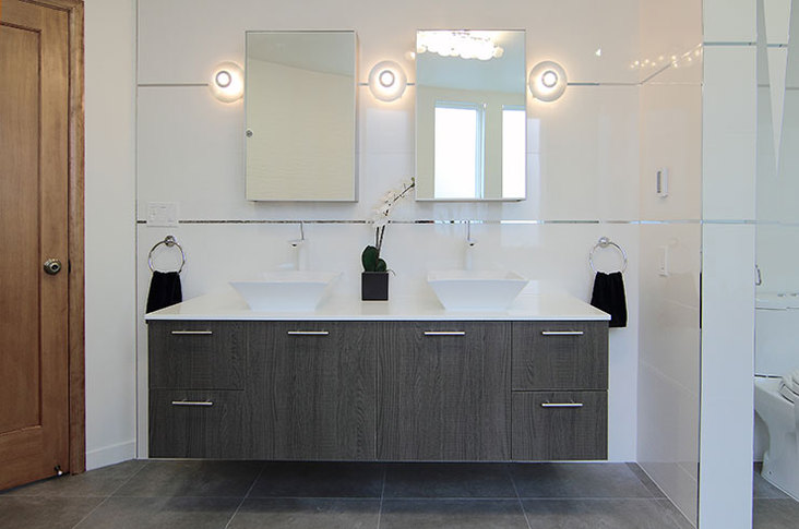
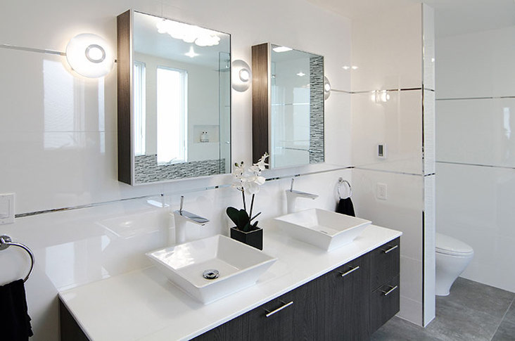
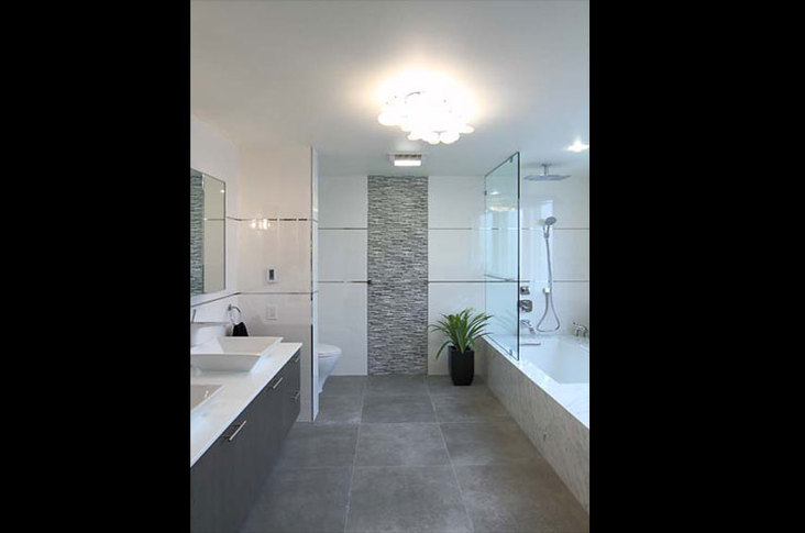
This white premise steered Sikander and the clients toward clean lines and a contemporary aesthetic. “We started with white tile for the walls because it was very sharp and clean looking,” she noted. “That started the design process when it came down to the bathroom – very clean and minimal.” These 12-in. x 35-in. tiles cover the walls with a white glass backdrop. A metal trim wraps around the walls and accents the tile.
To blend with the neutral palette, Sikander chose a light gray, oak veneer for the vanity. “It was really hard to find, since most choices were either espresso or chocolate brown,” she added. “We got lucky and found something that really worked and has a nice gray, brown tone to it.” The vanity is topped with vessel sinks and quartz countertops.
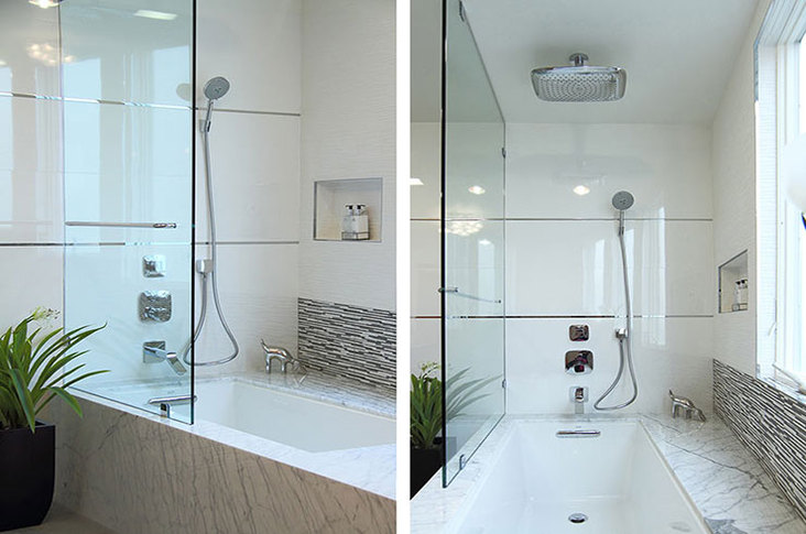
“Originally I was thinking of using a gray quartz as well for the tub,” explained Sikander. “But then I came across this marble.” The tub’s statuarietto marble surround boasts a gray pattern that suits the palette. “I really wanted to use something to give it more of a classic look within the modern and contemporary theme of things,” she added. In the combined tub and shower, the large white tiles stop at the exterior wall, which proved to be the project’s main challenge.
“Laying out tile properly was a challenge because it’s a curved wall,” said Sikander. “Everything else is really linear, but because of the positioning of the tub, we were fighting back and forth on what materials to use.” Sikander’s plans for shelves or a recess fell to the wayside when the contractor, Pavel Kantor of Progress Builders, noted the difficultly in shaping the marble and the potential problems with water drainage.
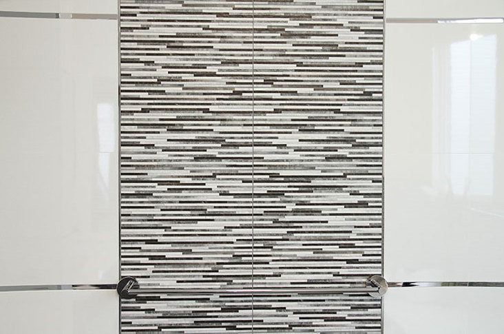
“So we decided that we would keep it simple,” she commented. Since the white tiles were too large for the angle of the wall, black-and-white textured tiles break up the white and follow the shape of the walls more easily. The black-and-white tile repeats on the far wall as a focal point upon entry.
“I think we got what we wanted, in that what we had in mind with that curved wall actually happened,” said Sikander. “There were a lot of issues, but since that was the most difficult part, I’m proud of what we achieved.”
Tips for Working with a Curved Wall
• Choose smaller tile over large pieces.
• Pay attention to square footage and pay close attention to the measurement of the wall.
• Have extra tiles just in case, so as to not delay the project.
