November 25, 2013
Stepping back into a space she had worked with previously, designer Jerri Kunz already knew what the issues were. “On the first redesign, the owners didn’t want to totally gut it,” said Kunz, founder of Jerri Kunz Interior Design.
The cottage-style house had a closed in, claustrophobic master bath, which on the initial redesign was slightly alleviated with small changes. “But then we went back in and got serious,” she said.
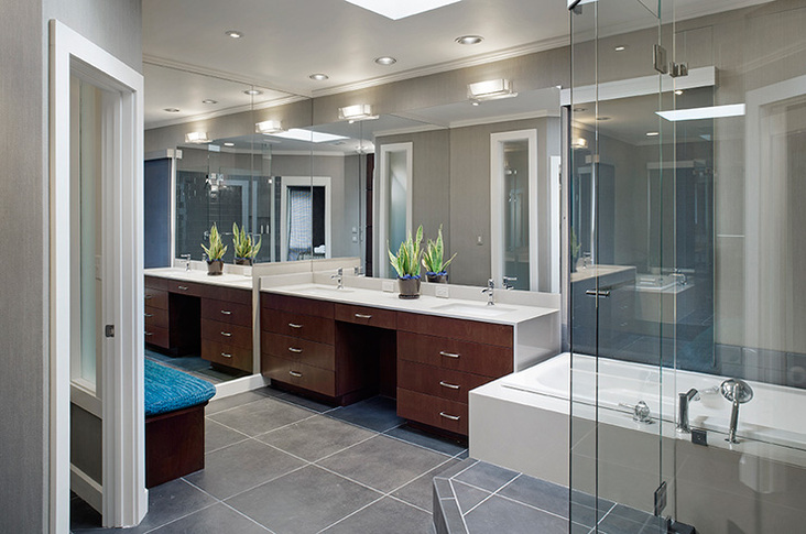
Full of details and various materials, the already small bathroom seemed to shrink every time a new design element was added. “It was kind of a hobbit hole in there,” Kunz explained. To create the illusion of more space, the design team smoothed out the planes, eliminating feature strips, tile details, steps and ogee edges. “We got rid of any extraneous decorations,” she said. “What you do is clean it up. You have as few lines and as few materials as possible to give a sense of space.”
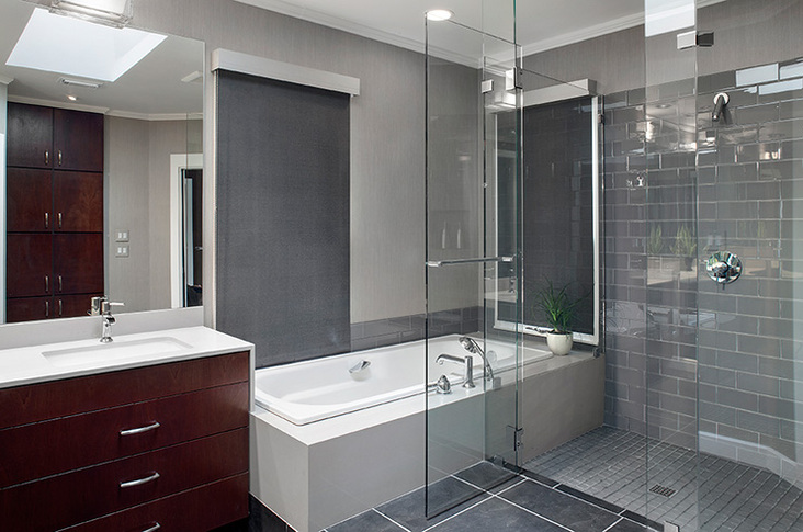
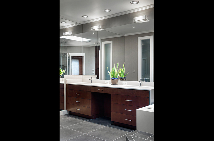
Caesarstone countertops pair with mahogany in the vanity for a clean contrast. The simple fixtures offer little adornment with their minimal detailing. “I wanted to keep all of that looking like it was one piece, as opposed to cut up in various sections or functions,” commented Kunz. The same Caesarstone material is used in the tub surround.
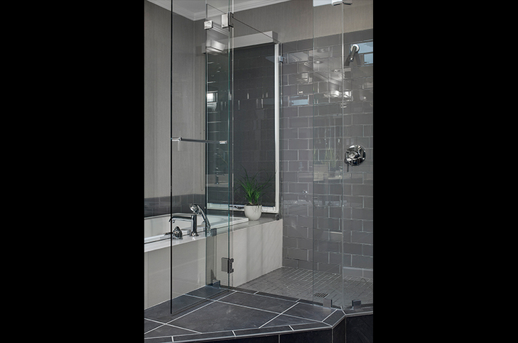
Unable to move the bathtub from its location because of plumbing, Kunz worked in collaboration with David Wilkes Builders around these space restrictions for a more comfortable layout. “It was just impossible to move anything,” said Kunz. The tub’s awkward faucet was relocated, and the corner tub gained a glass tile backsplash that flowed into the shower backsplash as well.
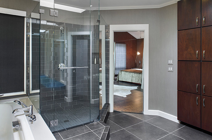
As the shower itself used to be tile clad, Kunz replaced the walls with glass for openness. “That way we could see through the shower section into the tub corner,” Kunz explained.
Also in redoing the shower, a platform was removed to make the space safer, larger and more continuous. “He wanted the space to feel bigger and be more spa-like,” she added. “He wanted something really urbane and masculine.”
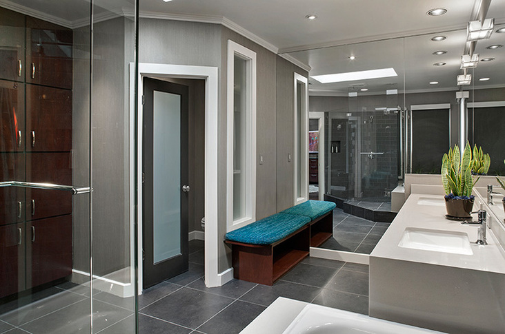
Along with the limited materials and the clean lines, this masculine feel originated from a dark color palette. “There’s nothing really fluffy in there,” commented Kunz. Gray tile floors and calm gray walls create a neutral tone overall, and the only pop of color in the otherwise dark space is a turquoise upholstered bench. “We needed to enliven the space a bit,” said Kunz. “I also wanted to cool it down somewhat.”
Lighting these warm, dark tones, the previous furdown lighting was removed and replaced with recessed, adjustable lights. “I do not approve of overhead lighting in the bathroom,” explained Kunz. “I like the lighting to come from the face.” Two square sconces on the mirror line provide this facial illumination.
“It was a simple design, but the simplest things can be very difficult to achieve,” said Kunz. “I was very happy with the end result.”
