September 25, 2020
When one family moved from Montana to New York, their biggest request was for a kitchen that reflected their personality. With three children and three dogs, the client looked to designer Keia McSwain of Denver-based Kimberly + Cameron Interiors to transform their drab and traditional space into a memorable and joy-filled room.
From Boring to Bold
“The kitchen was dated and somber in color – depressing almost,” said McSwain, adding that her main goal was to insert more tones and update the lighting and finishes.
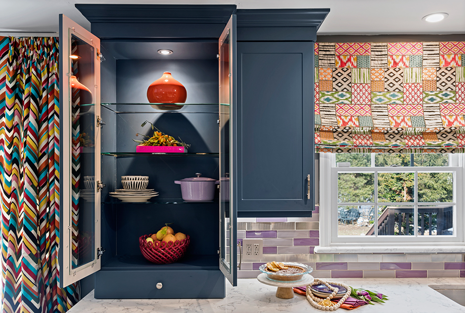
This might seem like a fun and easy task from the outset, but the design team was faced with a short time frame. This busy family could not have their kitchen out of commission for too long, so the designer came up with quick ways to refresh and renew. This started with the cabinetry, originally a demure color with an outdated style that they decided to reface to save time.
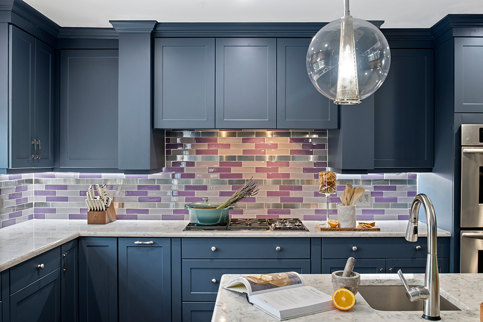
“The refacing company, Kitchen Magic, brought in options for cabinet colors,” said McSwain. “I fell in love with this new blue shade the rep happened to have in his car that day.”
According to the designer, this tone was perfect for this busy family because blue promotes peace and tranquility. It also enhances both physical and mental relaxation – a benefit she wanted to give her clients and particularly the youngest daughter, who has cerebral palsy.
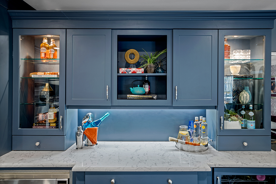
Three weeks later, the cabinets were returned with subtler, modern frames – some with glass insets – and most importantly, the deep blue color they chose and the starting point for the kitchen’s color palette.
Client-Centric Colors
While blue made up the core of the space, there were several other key shades the family wanted to incorporate.
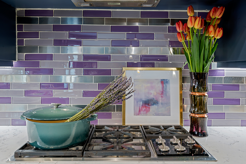
“The client has a huge obsession with color, but I wasn’t given much instruction on what the family did or didn’t prefer in regard to it,” said the designer. “She definitely specified that purple was mandatory because it was her favorite color, so my charge then became how to make it classic.”
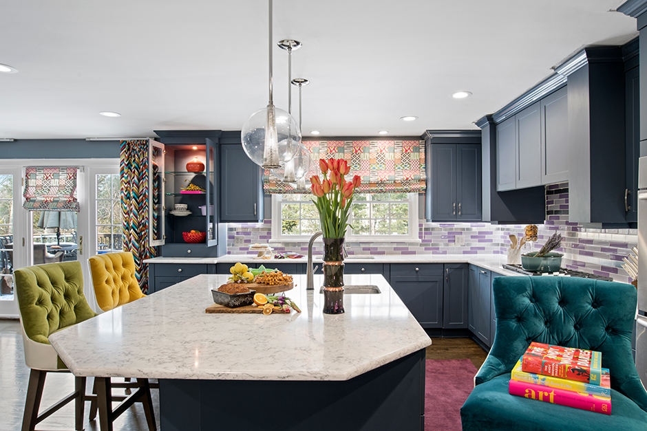
This hue was transferred through the back splash, where all the long, narrow subway tiles are the same size and shape but not the same color. McSwain alternated tiles in purple and lavender with tiles in stainless steel – all of which tie in both the colorful cabinetry and the new stainless-steel appliances.
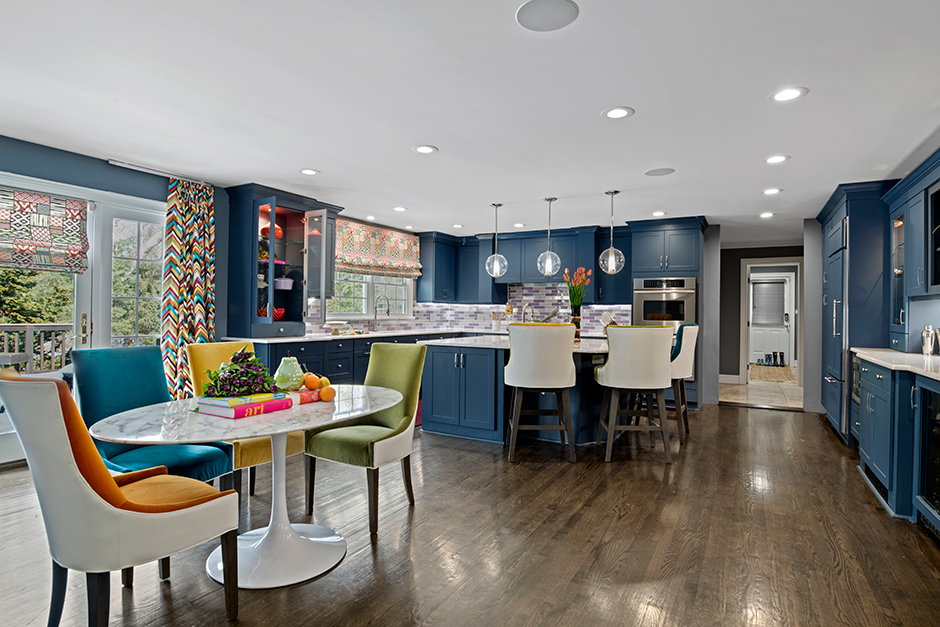
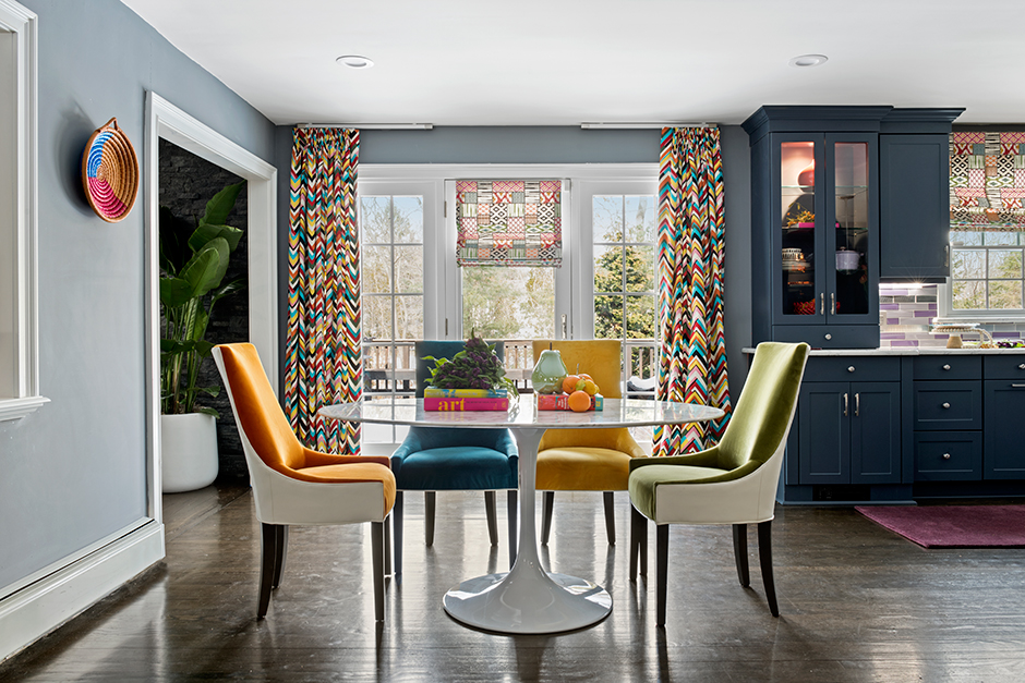
Another important color contribution came from the clients’ youngest daughter. While the child’s favorite color is green, McSwain wanted to incorporate the tone in a comforting way that did not feel overwhelming. She used it in several chairs around the kitchen table and the bar; the other chairs are a contrasting mustard yellow, orange and aqua. All can be easily moved around to accommodate different seating scenarios.
Green – as well as the other colors in the space – reappear in subtler tones on the wildly patterned drapery in the kitchen windows. Set in close proximity to the blue cabinetry and the blue-painted walls, the color and patterns in the fabric help pull it all together.
“The ability to create a space for an amazing family was one thing, but bringing color and pattern play to life was definitely my favorite part of this project,” said McSwain.
Source List
Designer: Keia McSwain, Kimberly + Cameron Interiors
Photographer: Rayon Richards Photography
Cabinetry Refacing Company: Kitchen Magic
Chairs: Mitchell Gold
Countertop: Calacatta Quartz
Dining Table: Aeon Furniture
Fabric: Kravet
Faucets: Kohler
Lighting: Arteriors
Stools: Mitchell Gold Bob Williams
Tile: The Tile Store
