

June 9, 2014
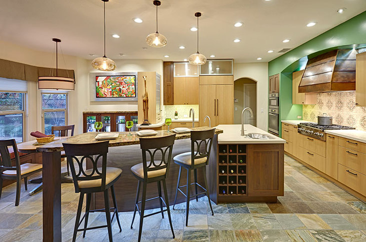
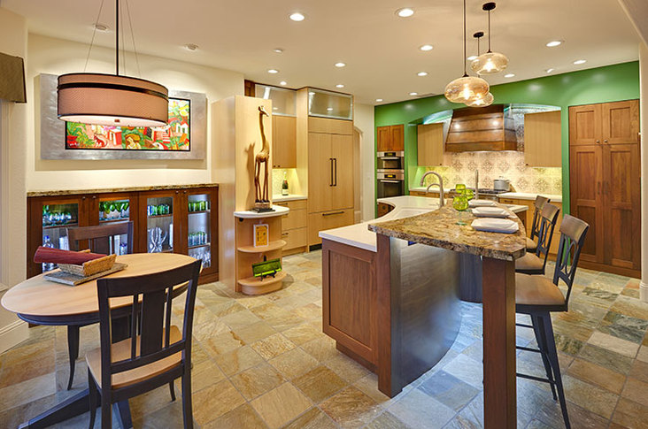
Design inspiration often begins with falling in love with a location. For one Davis, Calif., homeowner, recent travels in Mexico culminated in a collection of bright paintings. One in particular anchors her kitchen redesign.
View this kitchen gallery here.
“The people in the painting are very charismatic, and the buildings have Spanish-style roofs,” said designer Nicolette Patton of Nar Fine Carpentry. “She wanted to bring that out in her kitchen.”
Working alongside designer Nar Bustamente, Patton started solving the issues of the typical builder-style kitchen. A lack of storage had left kitchen gadgets scattered and homeless.
“We just tried to give her ways to organize,” explained Patton. “Before, she basically had things piled up on her countertops that didn’t allow her to use the prep space.”
Along with the shortage in drawers, the kitchen had an awkward peninsula that blocked in the entire space. “You had to walk all the way around the kitchen to get to the sink,” she added. “It just wasn’t working for her.”
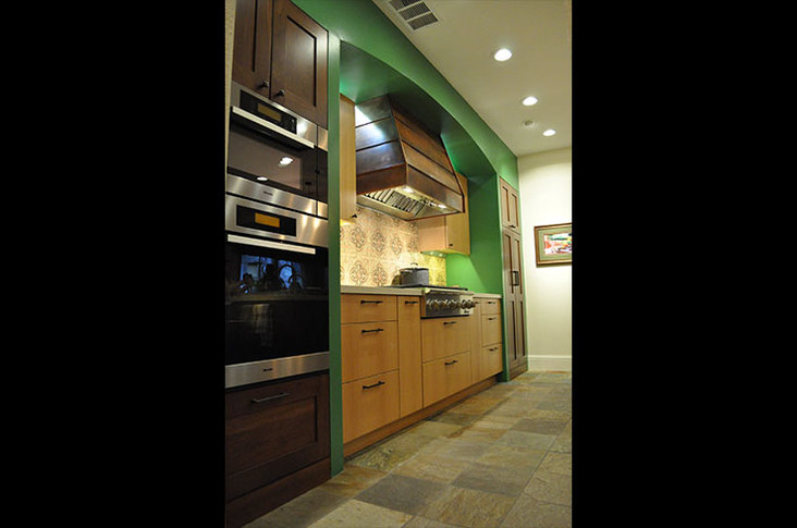
With the painting as the main inspiration, the design team brought in a bright green accent color. This green, arched wall behind the hood complements other arches in the house.
“We wanted to go bold because the colors in that painting are very saturated,” explained Patton. However, pitching that bold color proved a challenge. While the client pushed for a softer, sage green, Patton explained, “It wouldn’t give us the impact the bright green would.” The resulting accent wall stands out against the other neutral-toned walls and brings out the brightness of the painting.
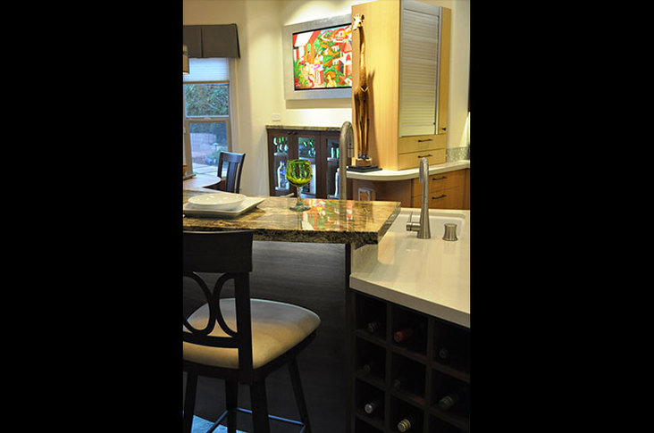
The curved arch inspired the walk-around island, which has square, segmented cabinets but a curved top. A prep space lies across from the hood and holds the main sink and the curved side of the island holds an additional sink.
“We really felt we needed a sink on that side so you didn’t have to walk all the way around to use the main sink,” said Patton, adding that this second sink boasts a built-in colander and a cutting board. The eating bar maintains the curve with a granite countertop that grows wider on one side.
This darker granite contrasts with the rest of the kitchen’s light quartz counters and the cabinets around the perimeter. Made with natural anigre, these cabinets have a wavy grain and a ripple effect that add a touch of the exotic to the space. Darkly finished walnut makes up the tall cabinets on the island.
“We used that to anchor the space and just bring in some of those warmer tones that you see a lot in Mexico and Spain,” said Patton. “It also went really well with the cooper hood.”
Behind the hood, the hand-painted tile backsplash once again recalls the Mexican inspiration. “In Spain you see a lot of the cement tiles and hand-painted tiles, so we started looking in that arena,” she said. By customizing the tile with green, beige and orange colors, the backsplash now has a floral pattern that coordinates with the painting and the whole wall to reinforce the Spanish style.
“For this bold of a design, there has to be a balance between color, texture and white space,” explained Patton. She emphasized the importance of lighting above all else, adding that every selection and functional tool should coordinate with the kitchen style.
“This client in particular was very specific about what goes where,” she said. “We planned down to the spoon where everything should go.”
One particular organizational tool the team suggested was a rolling aluminum door that hides a media center, complete with a charging station, a whiteboard and corkboard, as well as a rollout drawer for a laptop. “We all have chargers and laptops in the kitchen, but we don’t typically have a place for them,” she added. “Now everything has its own home.”
Tips for Going Bold
Nicolette Patton and Nar Bustamente took a bold painting and created a vibrant kitchen. Here’s how they did it without overdoing it.
-Balance color, texture and white space, with artwork considered white space.
-Put the importance on lighting.
-Don’t be afraid of accent colors.
-Add in subtle hints of the inspiration without overplaying the theme.
