October 4, 2018
Brooklyn, N.Y., is known for its character, and New York City-based Revamp Interior Design wanted to impart just that into a local home that was completely lacking personality. Built in 1899, this single-family townhome had two levels, but each was only 12 feet by and 31 feet for a total of less than 800 square feet.
“Our client was a developer who wanted this Brooklyn townhouse to have more originality yet maintain wide appeal for potential buyers,” said designer Cece Stelljes, who collaborated with co-designer Danielle Fennoy on the project.
Expanding the Layout
The first step in making this space seem larger was literally adding square footage. The design team started by removing the back façade and extending the townhome itself by 25 feet and adding a third level of living space and a finished roof deck.
“Given that we nearly tripled the size of the residence, our client needed the kitchen to be much larger, as well as light and modern,” said Fennoy.
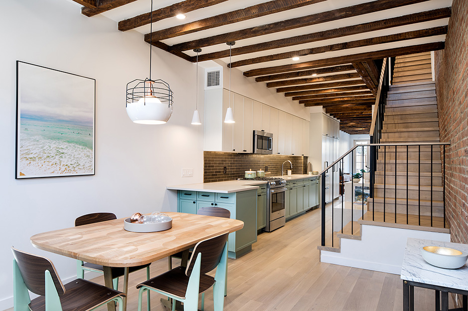
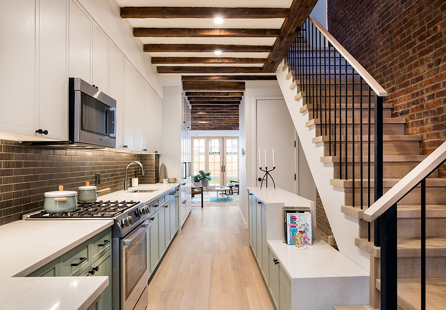
The original kitchen on the ground floor was cramped and very dark, with only a small window and a bare ceiling-hung bulb to light the space. Dated wood wainscoting and a floral wallpaper ceiling border added to the kitchen’s gloomy design. The client not only requested that all of this be opened up but also wanted a powder room and adequate kitchen storage on the same floor.
“We met these goals by locating the kitchen in the center of the narrow building on the ground floor, across from open-riser stairs,” said Stelljes, who added that the team used AutoCAD for floor plans and elevations and Photoshop for rendered 2D elevations. “The powder room is off to one side, and all closed storage is in the kitchen, against the wall in the tall cabinets and along the stairs in counter-height cabinetry.”
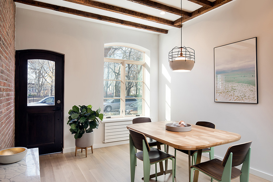
Now the ground floor features a welcoming entrance with a larger window, white-painted ceilings with rustic wood beams and bleached white oak flooring. The eye goes through the long kitchen and to the back living area, which feels light and airy now with sliding glass doors that lead outside.
“Putting the kitchen in the middle creates a front-to-back circulation path that also functions as the generous open area,” said Fennoy. “Given the spatial constraints of this narrow building, such a layout adds major value. Not only do the owners have a fabulous kitchen, but the location of the living room in the rear allows it to be more spacious.”
Original Finishes
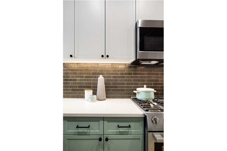
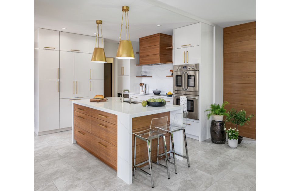
To accomplish the client’s goal of having a design with more character, the team looked at including materials that both fit the home’s age and suited the modern home buyer. They designed custom cabinetry with narrow flat framing, which created a more contemporary version of traditional Shaker doors. The top cabinets are a modern white, while the bottom cabinets are a soft green, which Stelljes says feels beautiful and fresh.
White Caesarstone countertops were chosen to portray the look of natural stone without the maintenance, and a bronze-glazed ceramic tile backsplash contrasts the light finishes and echoes the dark ceiling beams overhead.
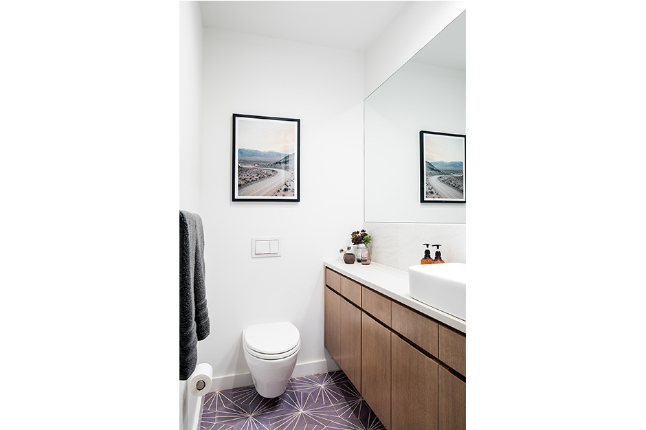
Off of the kitchen, the powder room offers substantial storage in its custom vanity and contrasts the kitchen palette with a lilac-toned, geometric tile flooring. The white walls and stained wood vanity complement the fun flooring with their simple and modern appeal.
Standout Master Bath
Just like in the kitchen, the designers were challenged by the narrow dimension of the home when they set out to create a luxurious master bathroom and maintain adequate circulation and closet space.
“Our first breakthrough solution was to push the second staircase deeper into the layout, thus allowing plenty of space for the master suite in the front portion of the building,” said Fennoy.
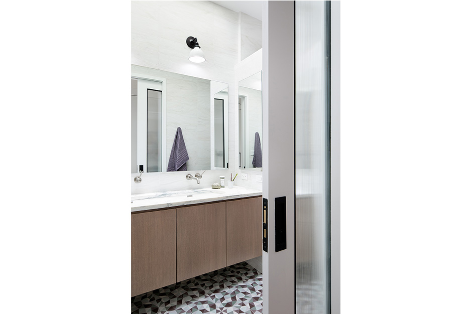
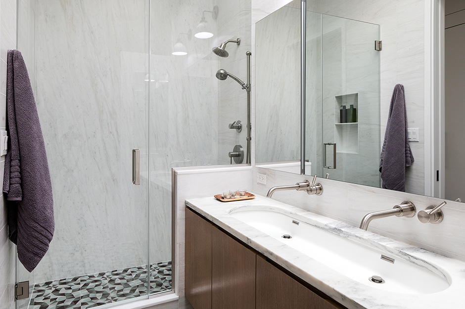
They then laid out the master bath as a long, relatively shallow room with pocket doors and a large skylight overhead. A 6-ft.-long custom vanity with stained wood panels provides plenty of storage space, as well as double faucets and a spacious sink.
“We love using a stained wood finish for bathroom vanities, as it brings the warmth of natural wood and durability,” said Stelljes, adding that over time stained wood shows less wear and tear than a painted finish.
The team kept the walls light by lining them with full slabs of marble in the shower and marble tile on the other walls. The countertop, also a marble slab, features subtle green veining to complement the bold flooring.
“We fell in love with this cement floor tile designed by Laura Gottwald for Original Mission Tile,” said Fennoy, pointing out the intricate and geometric green and purple tile flooring. “This color palette in particular set the tone for the finishes we selected throughout the project, from the mint green cabinetry in the kitchen to the purple tile in the powder bath.”
Source List
Designer: Cece Stelljes & Danielle Fennoy, Revamp Interior Design
Photographer: Travis Mark
Kitchen
Backsplash Tile: Ann Sacks
Cabinetry: Custom by Revamp Interior Design
Countertops: Caesarstone
Dishwasher, Microwave & Range: Bosch
Faucet: Delta
Hardware: Emtek & Top Knobs
Refrigerator: Liebherr
Master Bathroom
Countertop & Wall Tile: Stone Source
Faucets: Mirabelle
Floor Tile: Original Mission Tile
Lights: Schoolhouse Electric
Shower Fixtures: Mirabelle
Sink: WETSTYLE
Toilet: TOTO
Vanity: Custom by Revamp Interior Design
Powder Room
Bath Accessories: KOHLER
Faucet: Mirabelle
Floor Tile: Mission Stone & Tile
Light: Schoolhouse Electric
Sink: Kraus
Toilet: TOTO
Vanity: Custom by Revamp Interior Design