When the layout feels illogical, sometimes it is the balance of the space that needs to be adjusted. For designer Alison Giese, this type of challenge is an opportunity to open up a room and infuse it with the correct proportions of color and texture.
Making Sense of a Jumbled Layout
Giese’s clients wanted an updated floor plan, with a larger island for prep and entertaining, but the existing kitchen had a long way to go before it lived up to their expectations.
“The original design of the kitchen seemed like a jumble; the cooktop, double ovens and fridge were all sort of clustered together,” said the designer, who is the founder of Washington, D.C.-based Alison Giese Interiors. “The small island that included a cooktop left limited space for it as a prep and seating area.”
To create a prepping area that made more sense, Giese first removed the corner pantry, which allowed her team to square off the back wall and create a symmetrical floor plan. This would also allow them to have an unbroken counter that ran the length of the back wall, where the range was also moved. The fridge and pantry cabinets were moved to the adjacent wall.

The storage that was lost from the walk-in pantry was replaced with pantry cabinets in hutch-style towers that flank the refrigerator, as well as lots of deep base-drawer units. The new island also contributes storage with extra drawers and space for an undercounter microwave.
Contrasting Colors
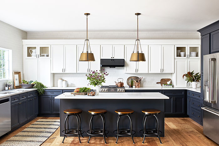
The clients – who considered themselves more traditional – wanted a light kitchen but not something stark white. They also wanted to replace the existing tile flooring with a pre-finished, wide-plank wood. While Giese admits that removing and replacing the old flooring was a messy job, the new flooring is now carried into the open-concept living area and keeps the spaces connected. It also complements the white and almost black-blue palette that Giese recommended.
“They were open to doing what I referred to as a ‘warm take’ on a tuxedo kitchen, with warm white cabinets on top of inky-blue bases,” said Giese, adding that she was thrilled that her clients went out of the traditional box a little and agreed with a high-contrast cabinet combination. “The choice of a warm white and inky blue maintained the traditional roots of the space, while feeling updated and fresh.”
The cabinets – which were from Giese’s cabinet line – were painted in colors “Candlewick” and “Peppercorn.” Two sets of upper glass-fronted cabinets were placed on each end of the back wall to emphasize the room’s symmetry, and white subway tile and white quartz countertops balance the two contrasting cabinetry colors.
The island has an overhang ideal for seating and is directly across from the range and hood. Hanging above the island, two brass pendant lights seem to frame the hood for a final touch of warmth and equilibrium.
“I loved seeing the kitchen come to life,” said Giese. “It was always a generous space, and we didn’t need to enlarge the footprint, we just needed to let in the light.”


