September 9, 2016
In the case of a smaller kitchen, a U-shaped layout is often the only option. However, when the floor plan leaves too much space unused, a complete overhaul of the layout might be the better option. For one Burr Ridge, Ill., project designed by Larry Rych of Brookfield, Ill.-based Imperial Kitchens and Baths, the original kitchen not only sported awkward unused space but also dated and even broken cabinetry.
Reconfiguring the Space
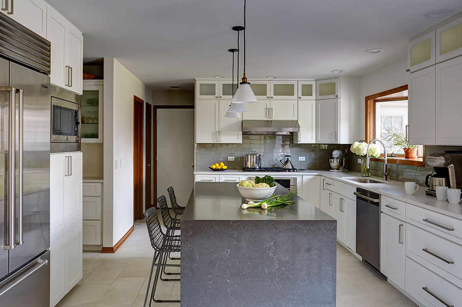
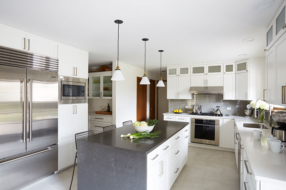
One of the main requirements for the project was an island to help utilize the space available. With an island, two main work triangles were possible. The main triangle would include the sink, cooktop, dishwasher and trash rollouts within steps of each other. The island would also be large enough that two people can cook together in the kitchen even when guests are seated across from the workspace.
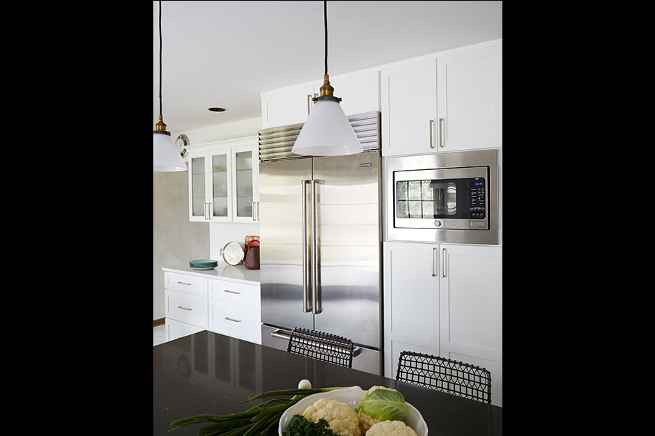
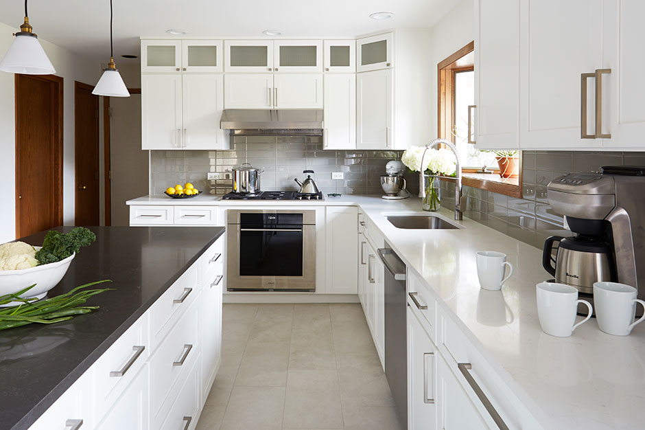
The second triangle involves the refrigerator, wall oven and a landing space at either the island or the kitchen table.
“Although we don’t typically think of the kitchen table as a work surface, many dishes are taken from the refrigerator or freezer, prepared in the microwave and then taken directly to the table,” said Rych. “This is especially true for a busy family.”
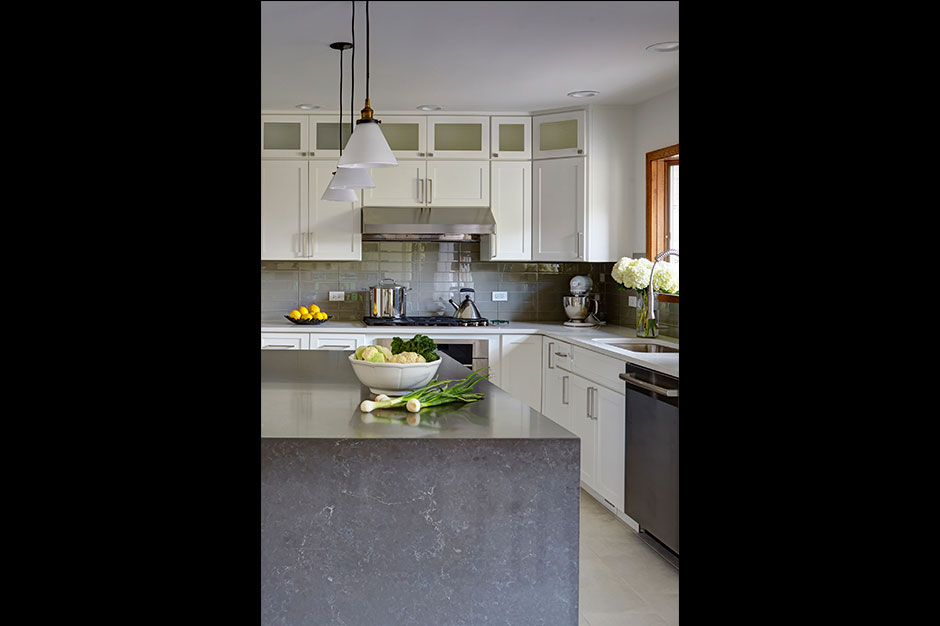
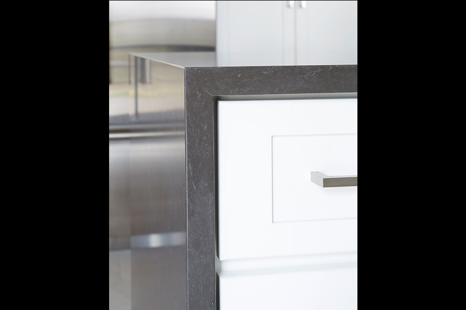
The island’s dark quartz top and waterfall end provide a visual anchor to the kitchen, in addition to creating seating that doesn’t interfere with food prep. The island’s location also allows guests to face the windows with their backs to the third working area: the butler’s pantry.
An extra perk for this kitchen was a revamp of this original pantry space. Acting as a food staging area between the kitchen and dining room, as well as the outlet to the basement, the pantry always had potential but was never used for entertaining. After bringing in new kitchen cabinets and counters that reflect the kitchen, the area was redefined as an extension of the kitchen.
“This little transition area has a feeling of spaciousness, interest and intent,” said Rych.
Solving the Soffits
Another challenge in reconfiguring the room was dealing with the 8-ft.-tall ceilings and dated soffits that seemed to close in the room. In their place and above the standard wall cabinets, the clients wanted 12-in.-high cabinets with glass fronts and interior lighting to visually open up the room and add storage space. In addition, the husband wanted a high BTU cooktop with the oven placed below it.
“The original soffit concealed the standard 6-in. round hood duct for the range,” said Rych, “but the high BTU range requires an even larger diameter duct. However, replacing the soffit with glass-door cabinetry – which would lighten the room – would expose the new larger duct.”
Concealing the duct depended on the team being able to slip it into a joist bay – the space between support beams– directly above the wall cabinets. A false back to the cabinet directly above the hood hid the piping as it went through, so the glass-fronted cabinets could be used and the BTU range installed.
A Timeless Look
The new cabinetry outfitting the three work areas and replacing the soffits is classic, white-painted Arts and Crafts style cabinetry. Around the perimeter, white quartz countertops with gray veining complements the bright palette.
“The white interior of the cabinets is highly reflective and has a wonderful glow from the interior LED lighting,” said Rych. “A modern waterfall end on the medium gray quartz island top is a subtle cue to the focal point of this kitchen.”
Above the island, three pendant lights make a statement and pair with the recessed cans that are used for general lighting.
“Lighting really is the icing on the cake,” said Rych. “Without the definition that lighting provides, all that you have is a big white box with a slab of stone sitting in the middle of the room.”
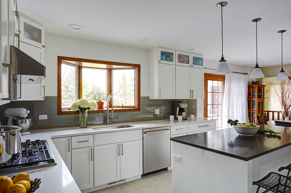
Designing Zones in an Open Space
Lighting was also used to continue the definition of the space. The open floor plan was ideal, but Rych still wanted to create a sense of zones. To keep the cabinets opposite of the patio doors – and on the far end of the working kitchen by the eating area – from looking like a complete continuation, the 12-in. space above the cabinets was instead left open.
This was the only area of the kitchen where the design team used Shaker Crown molding with uplighting, and the 30-in. cabinet doors have glass with interior lighting. The scene gives the illusion of a china cabinet and sets the eating space slightly apart from the cooking space.
“My favorite part of this project was the challenge of having three areas in a kitchen and creating them with their own sense of purpose and personality – all while keeping the design melded so that nothing upstages another aspect,” said Rych. “This room has a great sense of calm and balance when you operate within it. Thoughtful design should not be noticed but rather remain a background to our lives – facilitating an easier and happier existence.”
Source List
Designer: Larry Rych, Imperial Kitchens and Baths
Photographer: Mike Kaskel, Kaskel Photography
Cabinetry: Holiday Kitchens
Countertops: Caesarstone
Floor Tile: Slab Tile
Glass Tile: Tomei
Hardware: Top Knobs
LED Lighting: Econolight
Sink: Kohler
