Top Eight Trending Kitchen Cabinet Colors
© By Robert Kneschke - stock.adobe.com
May 20, 2021
By Semistories by Semihandmade
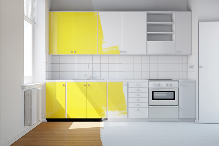
Color has become a big part of recent renovations, especially considering the turmoil of the last year. The bathroom is still seeing mostly natural and relaxing colors, but it is in the kitchen where the bold and vivacious thrive. Here are the top eight colors professionals see trending in the kitchen today.
The Subtle Blue: If you’re hesitant about dipping your toes into the world of color, then consider Farrow & Ball’s Blue Gray. This light, almost-neutral paint color may be your perfect match.
“I like how this weathered, cool blue-gray can subtly shift between the two hues depending on the time of day because of its blue, green and black pigmented undertones,” said designer Keita Turner. While it might feel natural to pair a cooler tone with silver or pewter hardware, she notes that this “timeless” hue works just as well with warm, rich tones, which can be incorporated in your countertop, tile and metal finishes.
The Perfect White: Every designer has their favorite go-to white paint, and for Ruqiya Imtiaz, that’s none other than Benjamin Moore’s Simply White.
“It instantly adds warmth and feels welcoming in any naturally lit kitchen,” she said. And just because you go with white cabinets doesn’t mean your entire kitchen has to follow a neutral color scheme. Imtiaz loves pairing this paint color with contrasting countertops and textured or patterned backsplashes for a more dramatic statement.
The Barely Navy: Black or navy cabinets are striking if you want to create some contrast in your space, but Catherine and Bryan Williamson of Beginning in the Middle have another favorite that offers just a little more depth: Behr’s Black Sable. The couple even used the paint in their own kitchen. The hue is surprisingly versatile.
“It’s a chameleon color that changes from blue to green to gray to black over the course of the day,” said Catherine. “It’s bold and makes a statement without feeling bright or trendy.”
The Wild Card: When she’s thinking classic, designer Eneia White loves the look of a light gray kitchen (Sherwin-Williams’s Rhinestone is her go-to). But sometimes, she likes to think outside of the box, such as Sherwin-Williams’s rich Fuschia tone, Dynamo.
“Dynamic and saturated, I love the energy this color brings into kitchens designed around entertaining,” she said. “All you need is a good home bar, and you’ll be pretty much set with the best setting for a cozy cocktail hour, whenever you want.”
The Inky Black: Although designer Mikel Welch enjoys the clean, bright look of a white kitchen, when he wants to try something different, he goes bold with Ressource Paint’s Abysse, a lush, jewel-toned blue-green.
“There is nothing like a rich darker-tone cabinet to give a space a regal and sophisticated feel,” he said. “This color is not for the faint of heart – it takes a confident kitchen to pull off Abysse!”
The Calming Gray: A good gray paint is just as classic as white or walnut when it comes to kitchen cabinets, and designer Anissa Zajac of House Seven Design calls out Sherwin-Williams’s Agreeable Gray as her own personal go-to.
“Because it’s so neutral, this color is versatile and complements most finishes and accent colors,” she said.
The Striking Oxblood: If your client is interested in the idea of darker cabinets but not quite sold on the green trend, then consider the opposite side of the color wheel.
“We just updated a tired oak island with Benjamin Moore’s Bewitched, a rich blood red,” says Britt Zunino of Studio DB. The warm tone pairs especially well with warm woods but can also look especially striking – even fashionable – with marble or glossy tiles. “It feels unexpected and a little edgy, which is incredibly chic,” added Zunino. “Plus, the saturated color reminds me of my favorite Chanel nail polish.”
The Breezy Blue: “Upper and lower cabinets don’t need to match,” said Clare Paint founder Nicole Gibbons. For a lighter feeling, she recommends white or neutral upper cabinets and a bolder choice like Goodnight Moon, Blackest and Deep Dive on the bottom. “Another of my favorite shades of blue for kitchens is a breezy blue-green hue called Headspace. It looks amazing on an island paired with marble countertops and is a great way to add color without overwhelming the space – and it also pairs perfectly with warm whites.”
More News
April 25, 2024 | Awards & Events
2024 Coverings Installation & Design Award Winners Announced
April 24, 2024 | People
Oatey Announces New COO and CCO
April 23, 2024 | Trends & Inspirations
Sustainability Report: More Education Needed for Green K&B Design
April 22, 2024 | Awards & Events, Trends & Inspirations
A Look Inside the 2024 Atlanta Homes & Lifestyles Southeastern Designer Showhouse
April 22, 2024 | KBB Collective
Top Designer Shares Favorite KBIS 2024 Products
April 2, 2024 | Sponsored
Whirlpool Corp. Brings Purposeful Innovation Home