2016 Color Trends for Home Furnishings and Interior Design Revealed
March 16, 2015
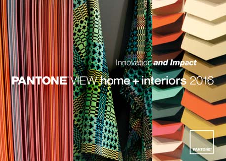
The Pantone Color Institute recently unveiled PANTONE VIEW home + interiors 2016 – Innovation and Impact, a color forecast highlighting trends for the home and interiors marketplace. Containing nine key palettes, plus individual color and material direction, the forecast provides designers with the information needed to make critical color decisions.
“As media continue to move toward more evocative, imaginative and innovative uses of color to woo consumers, unexpected color stories are emerging,” said Leatrice Eiseman, executive director of the Pantone Color Institute. “To capture attention and keep product lines relevant in the consumer’s eye, it’s important to understand the impact that this always-morphing innovation will have on color and design trends for 2016.”
PANTONE VIEW home + interiors 2016 contains visual inspiration, suggested color harmonies, individual tear-out palette cards for each of the palettes, swatches of the 77 forecasted colors and product imagery for use in presentations and storyboards. To enable digital design, PANTONE VIEW home + interiors 2016 also includes PANTONE Color Manager for direct download of all PANTONE Color Libraries into design software.
The nine palettes for 2016 are: Natural Forms, Dichotomy, Ephemera, Lineage, Soft Focus, Bijoux, Merriment, Footloose and Mixed Bag.
Natural Forms: Unambiguous colors, including shades that are plumbed from natural sources such as warm rosy clay and sheepskin beige
Dichotomy: Reinforcing the concept that opposites do and can attract as silver metallic, sunny yellow and bright cobalt blue combine with calmer versions of the hues
Ephemera: Pastel-focused, the palette blends delicate shades of wan blue, pale peach and tender yellow
Lineage: A palette where shades of navy, black, tan and regimental green co-mingle with touches of brighter colors
Soft Focus: Reveals subtle and/or muted colors, sometimes being described as “smoky” and always versatile
Bijoux: A palette that gleams with drama and intensity across many jewel tones
Merriment: A range of joyful shades, including vibrant greens and yellows contrasted with pinks and oranges
Footloose: Capricious color combinations with vacation-destination blues and blue-greens create a palette that supports the idea of throwing off the constricting scheduling of everyday life and simply enjoying the freedom of the outdoors
Mixed Bag: An assortment of eclectic patterns and prints with exciting and unique colors like pirate black and mandarin red as well as violet and florid orange
More News
April 25, 2024 | Awards & Events
2024 Coverings Installation & Design Award Winners Announced
April 24, 2024 | People
Oatey Announces New COO and CCO
April 23, 2024 | Trends & Inspirations
Sustainability Report: More Education Needed for Green K&B Design
April 22, 2024 | Awards & Events, Trends & Inspirations
A Look Inside the 2024 Atlanta Homes & Lifestyles Southeastern Designer Showhouse
April 22, 2024 | KBB Collective
Top Designer Shares Favorite KBIS 2024 Products
April 2, 2024 | Sponsored
Whirlpool Corp. Brings Purposeful Innovation Home