November 15, 2019
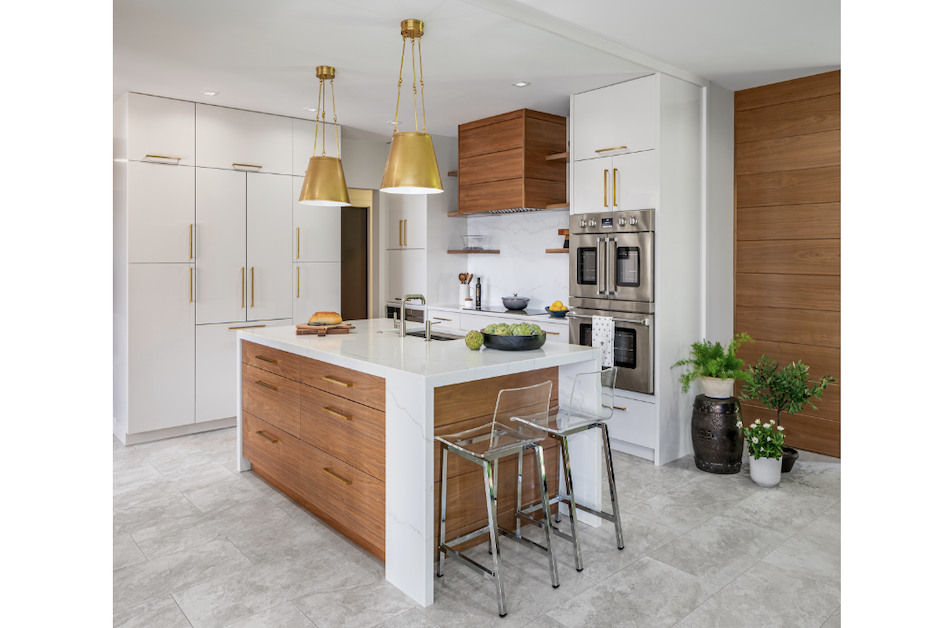
Kate Lester of Kate Lester Interiors was approached by clients who had already done a major renovation – a decade ago. While they loved the layout of their home and the installed materials were of good quality, the previous renovation was so on-trend at the time that it was now outdated. Lester’s goal for their second renovation was to ensure they did not have to renovate again anytime soon.
“Our clients’ main concern was to keep the home crisp, clean and classic,” said Lester, who is based out of Hermosa Beach, Calif. “Natural wood tones, white-based marbles and a really neutral, simple palette anchored the design.”
A Lasting Look
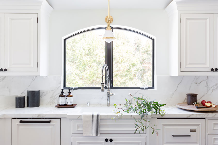
The main idea of this remodel was to keep some of the home’s more interesting details – like the archway in the kitchen – but to remove anything unnecessary. The clients’ believed the first and most important elimination needed to be a load-bearing wall cutting the kitchen off from the living space. However, Lester was not convinced it would be worth the cost.
“I knew that if we were to rethink the materials for flooring, countertops and all of the paint and molding details, we would be able to transform the space without the investment of relocating a structural beam,” said the designer, who used AutoCAD to design this space.
A coat of white paint throughout – including on the walls and ceiling – changed the entire feel of the home. Heavy crown moldings, dark flooring and outdated columns were also removed. The dated cabinetry was updated when the designer removed excess decorative wood elements, which she said enabled them to simplify and modernize the look of the space without replacing everything.
According Lester, simplicity was key to reworking the cabinetry well. They replaced the multiple bullnose details and heavy crown with a thin, flat molding. This infused a touch of elegance and Spanish flair without making the space feel too serious or heavy.
“We threw around names like ‘Spanifornia’ and ‘Modern French Chateau’ while we came up with concept for this space,” she added.
The resulting palette feels clean and relaxing, with an overall soft white throughout, touches of light wood in the exposed beams and flooring and matte black on the hardware. For the countertop, real marble was out of the question because the clients were avid wine connoisseurs and love to entertain. Instead, the designer chose a porcelain top that mimics marble.
“Now our clients won’t have to worry about citrus, wine or entertaining guests and got the look of a gorgeous Calcatta marble,” said Lester, explaining that this overall white and simple look allowed the client’s furnishings, rugs and vintage art and accessories to take center stage.
Freshening Up the Bathroom
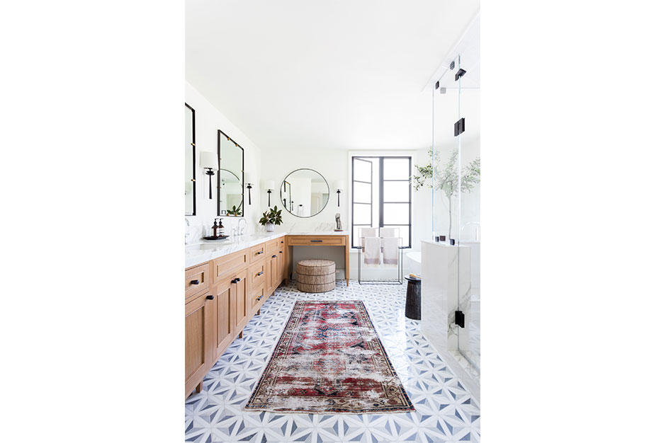
Like the kitchen, the master bathroom had also been updated 10 years ago but now seemed dark and dated.
“The layout in this space was just – for lack of a better term – wonky,” said Lester.
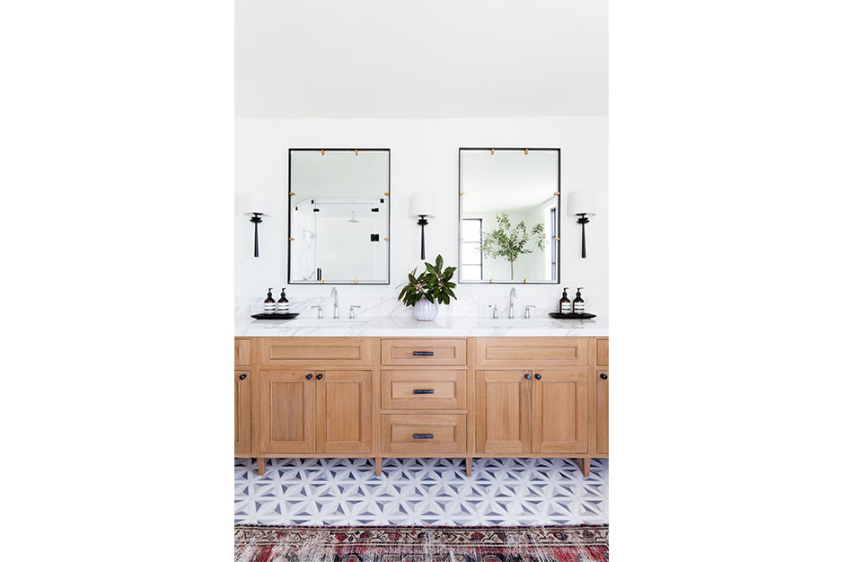
The his-and-hers vanities were separate and small, and the closet access was in close proximity to the shower. This made the designer nervous because she feared the moisture from the shower could be seeping into the closet and destroying the client’s French handbag collection. She then made her first tasks in the bathroom getting them more counterspace and configuring a less damp area for the purses in the closet.
“The challenge in this space was that, again, our clients had done that extensive remodel and had been really concerned with what was trending back then,” she said. “I knew this, so my biggest challenge was to design a concept that felt fresh and unique but also timeless. That means that I wanted them to be able to love this bathroom in 20 years, with only a few minimal tweaks.”
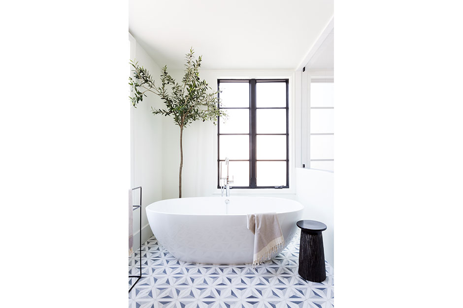
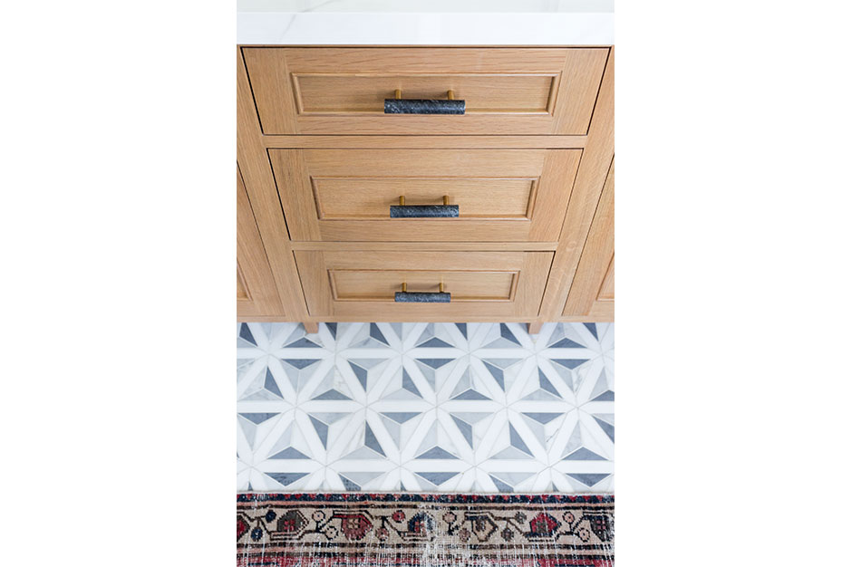
The main personality of the bathroom comes from the flooring, a black, gray and white tile in a geometric pattern. Black-matte fixtures, hardware and mirror frames add another layer of neutral color to the serene bath. A classic white, gray and black marble in the shower and the freestanding tub are the bath’s “wow” factors. The closet on the other side of the wall was reconfigured so the purses have a better home.
To keep the bathroom from feeling too stagnant, bleached wood was used for the vanity. This warms the space, as well as provides depth and dimension that isn’t always present in a bathroom this large.
“We specified these materials long before bleached oak was a ‘thing,’ so there weren’t that many inspiration images to show our client what we were thinking,” said Lester. “The design came together just as we envisioned. It’s bright, sophisticated, unique and effortlessly cool.”
Source List
Designer: Kate Lester, Kate Lester Interiors
Photographer: Amy Bartlam
Kitchen
Countertop/Backsplash: Neolith
Faucet: Kohler
Hardware: Schoolhouse Electric
Lighting: Circa Lighting
Bathroom
Bathtub: Victoria + Albert
Flooring: Artistic Tile
Mirrors: Restoration Hardware
Plumbing: Kohler
Sconces: Circa Lighting